Luni
The studio who create experiences that people enjoy for years and that are remembered forever.
- Constance RousseauDesigner
- Julie MartingDesigner
- Rémy GodetDesigner
- Roman RoyDesigner
- Jérôme GuffantiProject manager

Radical Freedom
Working on the redesign of Luni's website, a unique app studio, was a fantastic adventure! Through numerous iterations and hard work, it led Hervé's teams from expressing a need - attracting talents and conveying Luni's new positioning - to creating a tiny yet immersive universe.

Let the Luniverse be
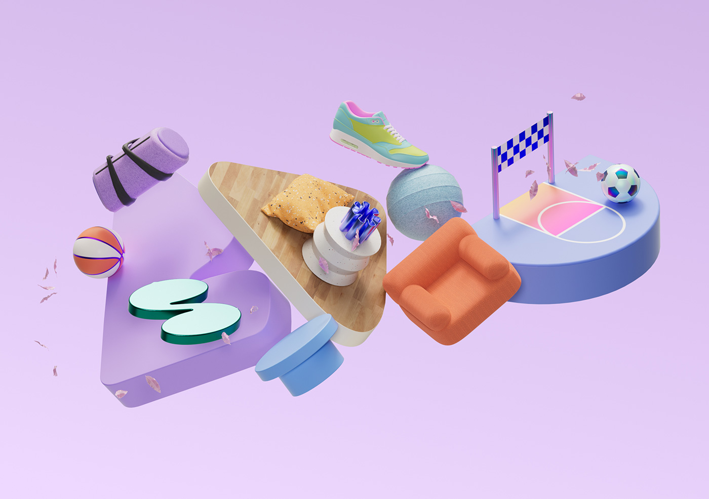
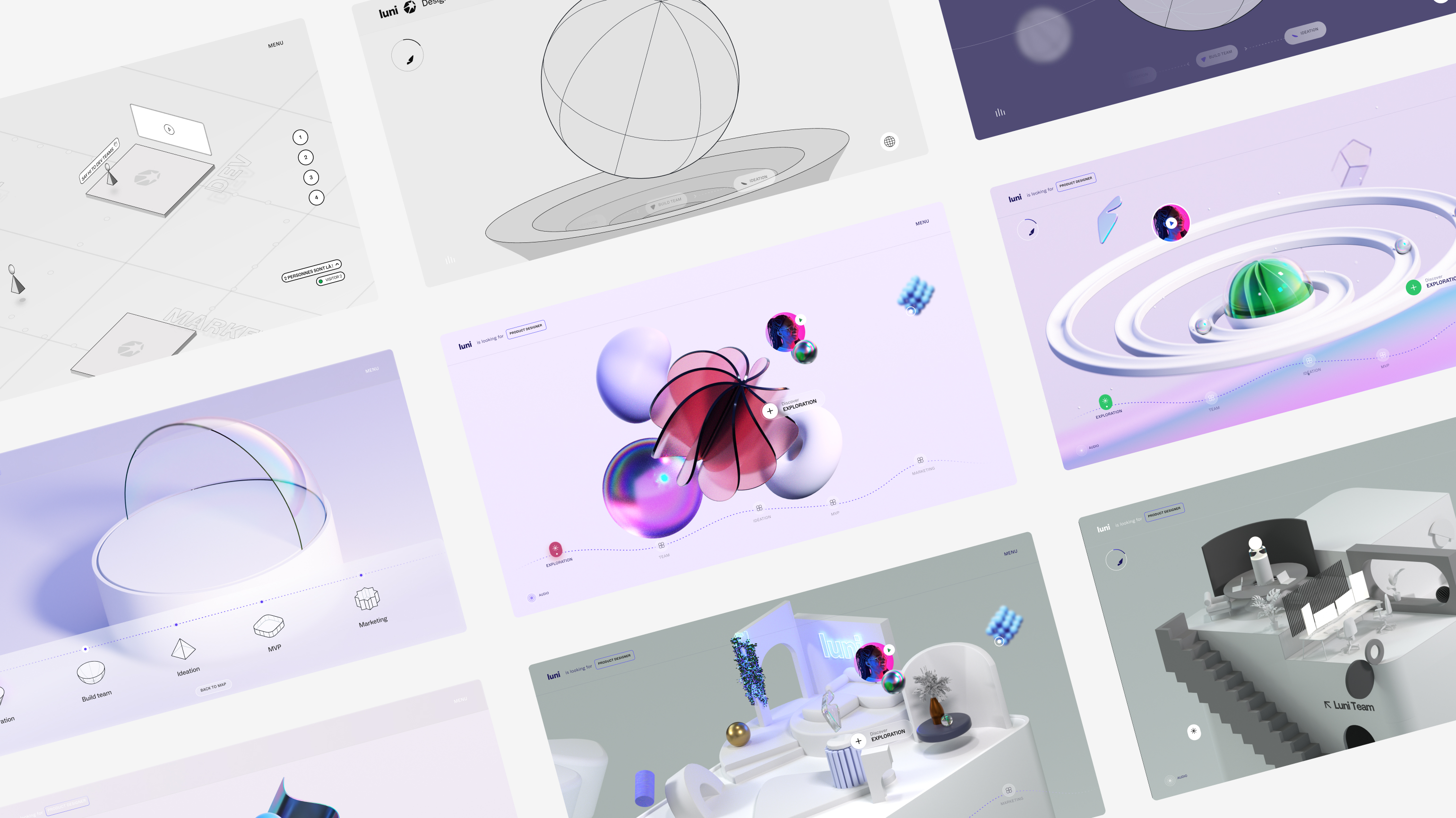
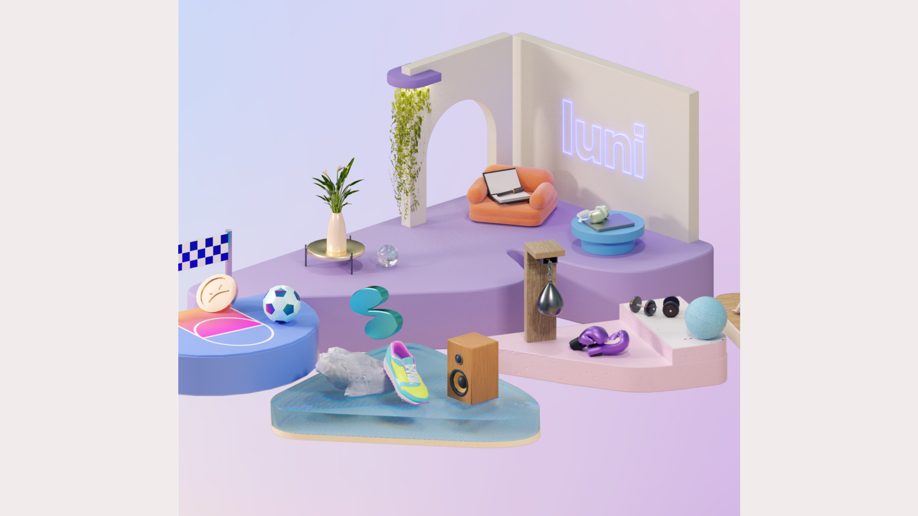
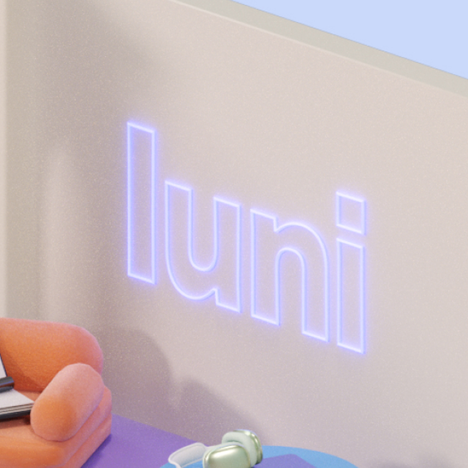
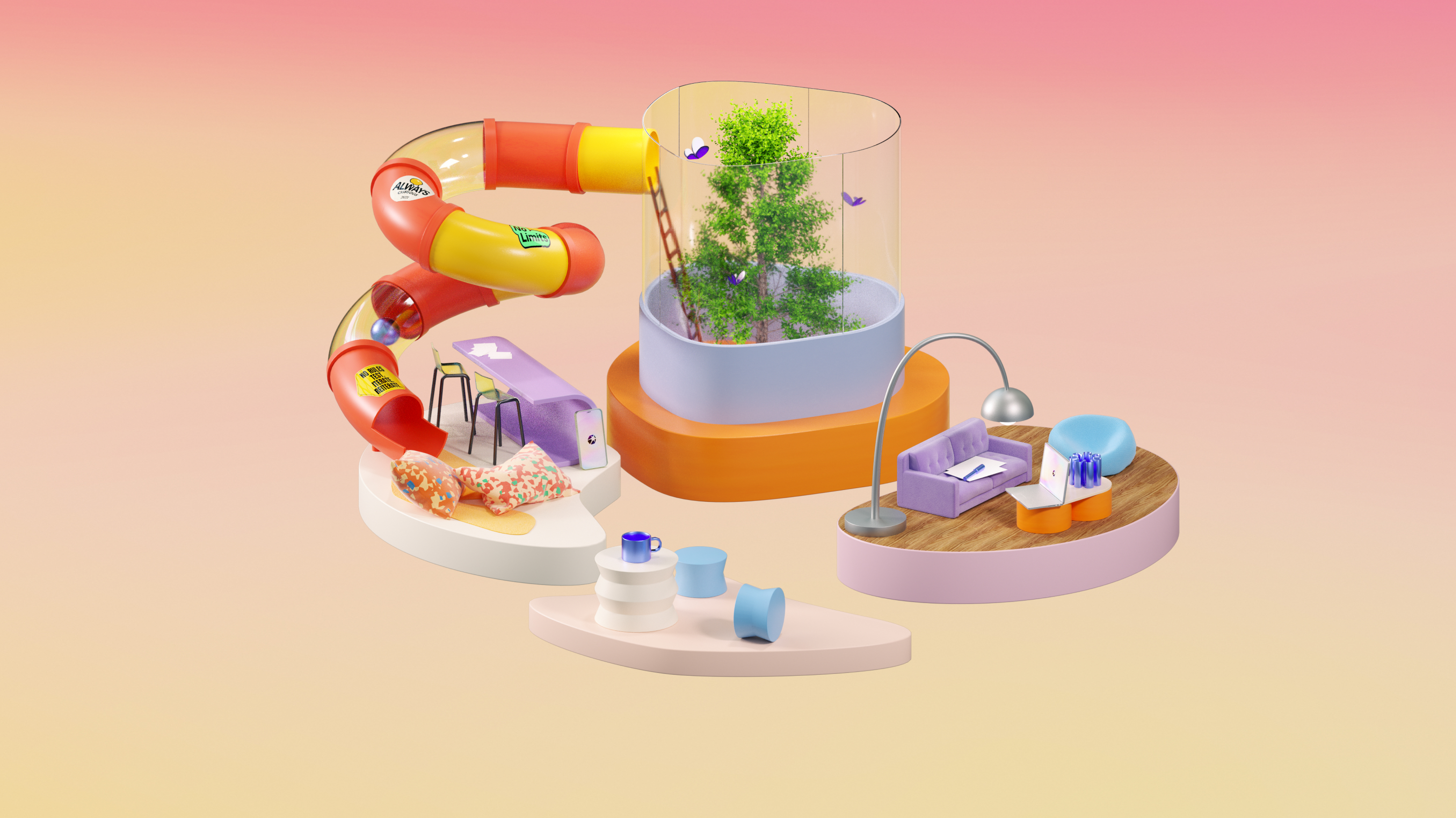
Luni's intention was to allow visitors to immerse themselves in its world through intuitive and innovative navigation on its website. It was during a research phase that the current navigation concept was born, affectionately dubbed 'the Luniverse'. Simple and flexible, this concept recreates a genuine little world where the site's chapters share a common space and harmoniously tell the story of Luni.
Inside the Luniverse
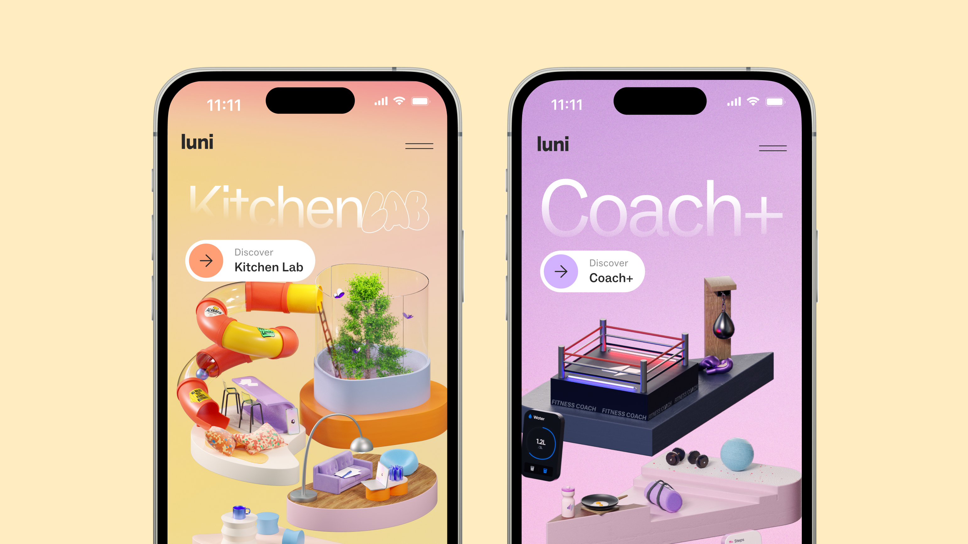
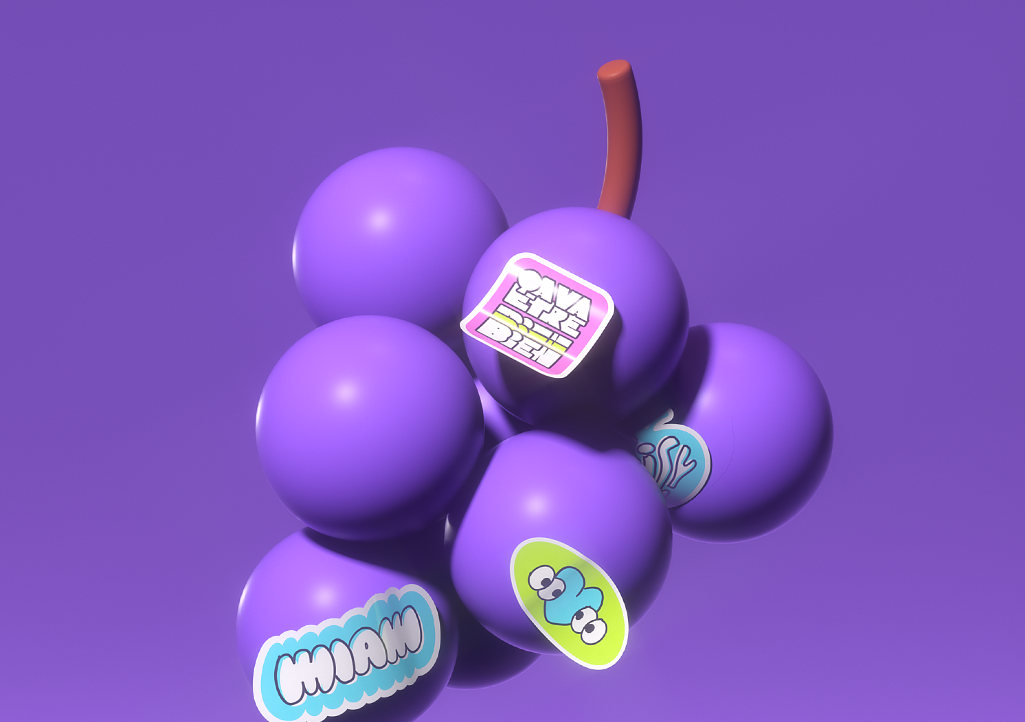
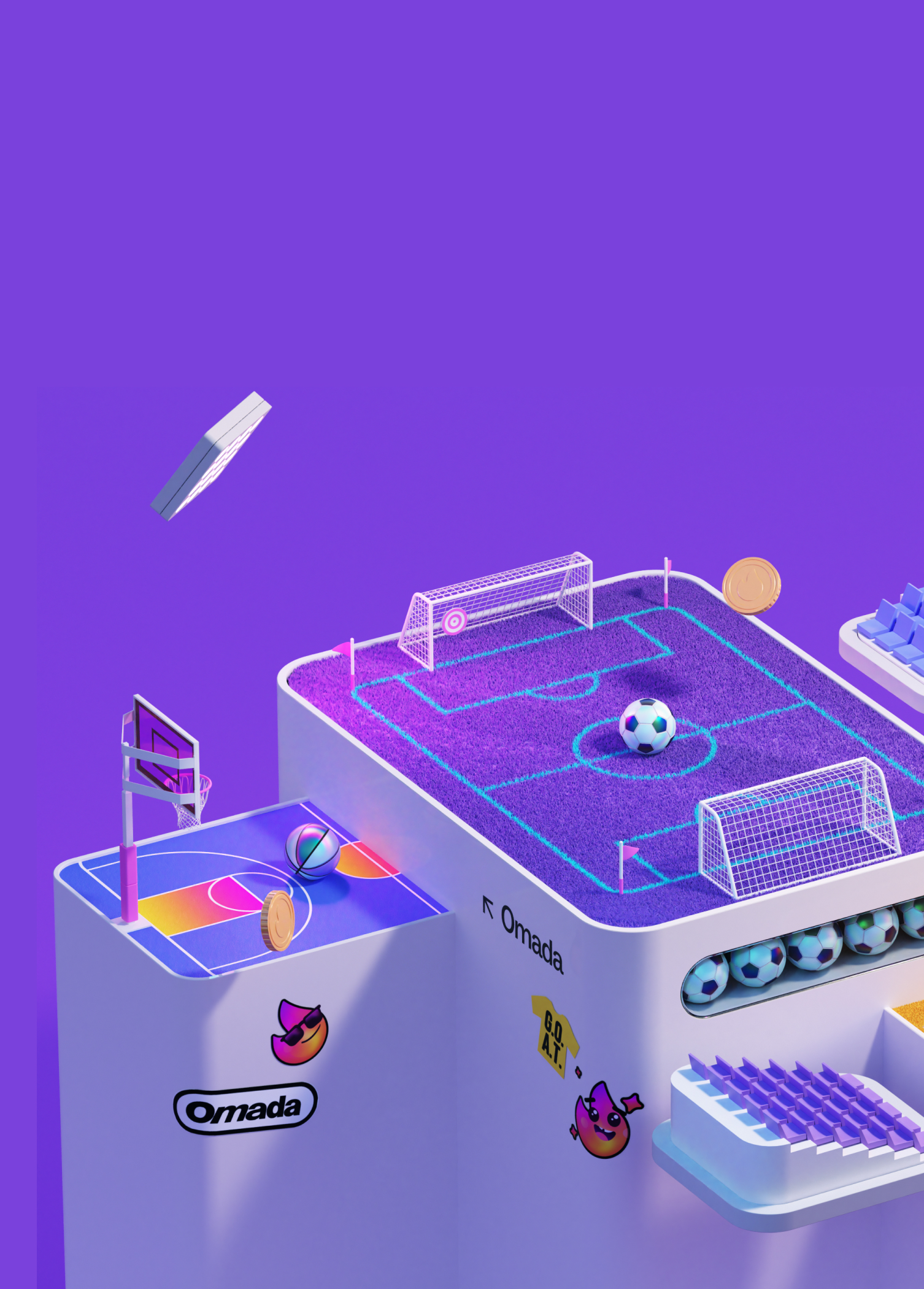
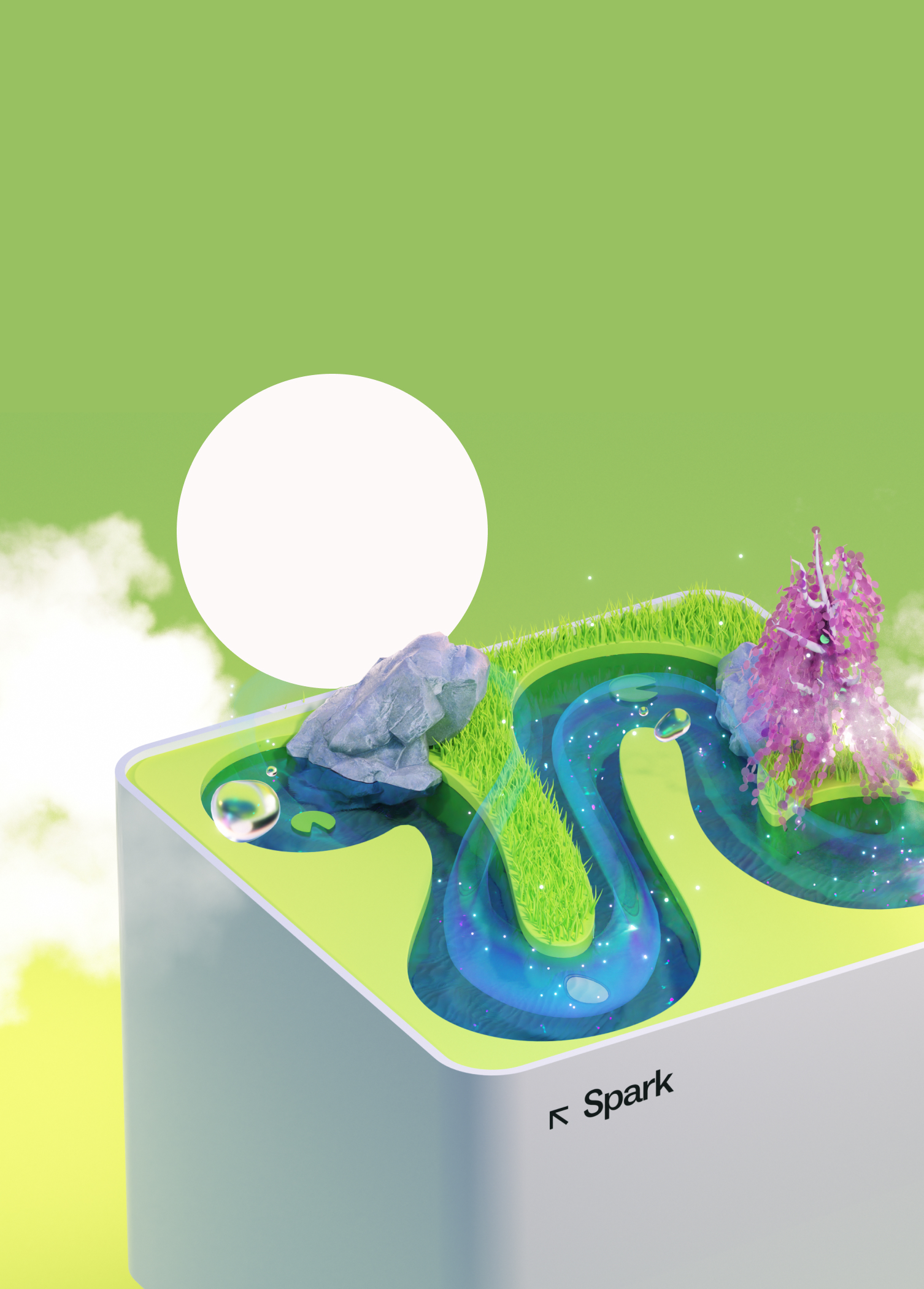
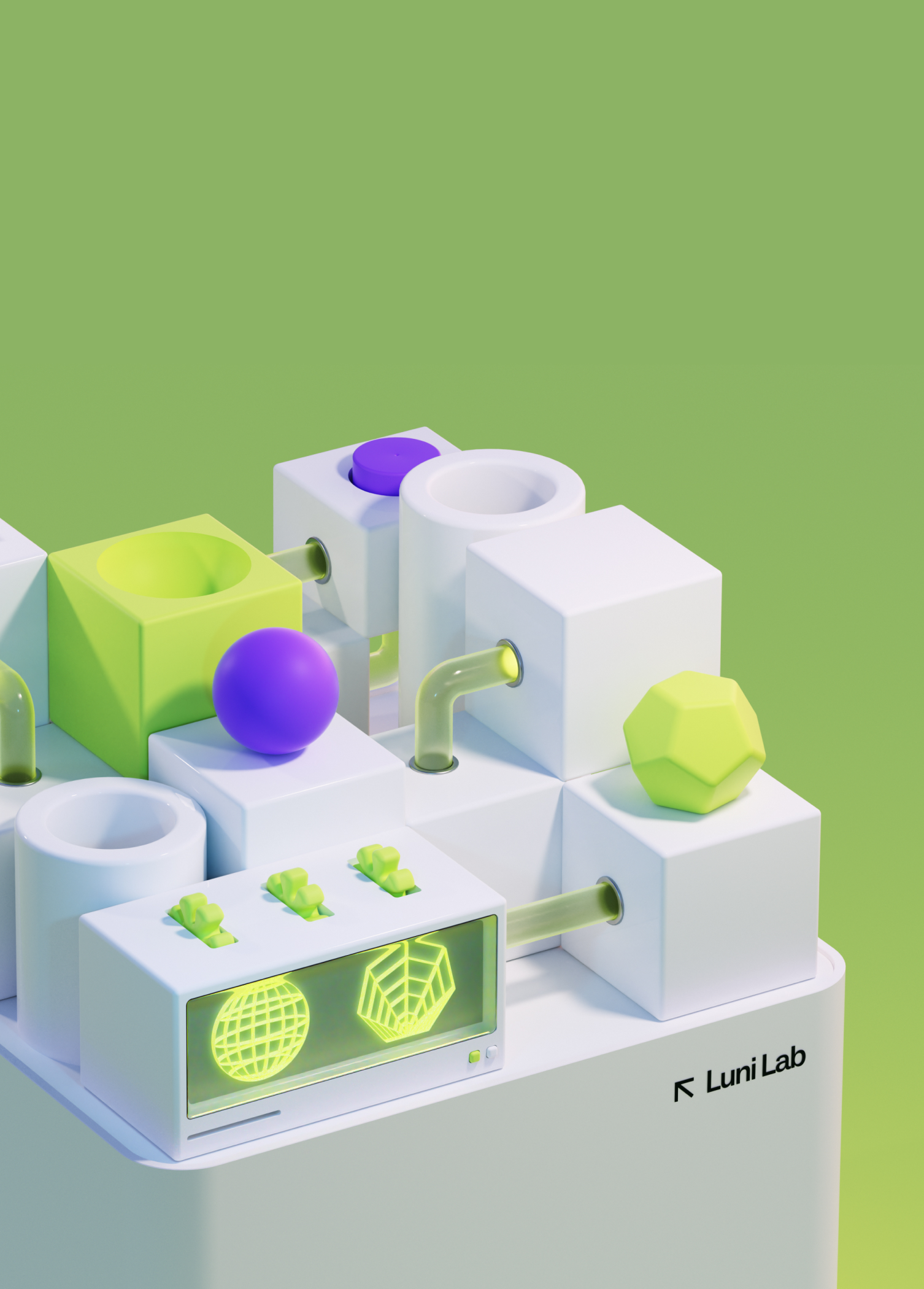
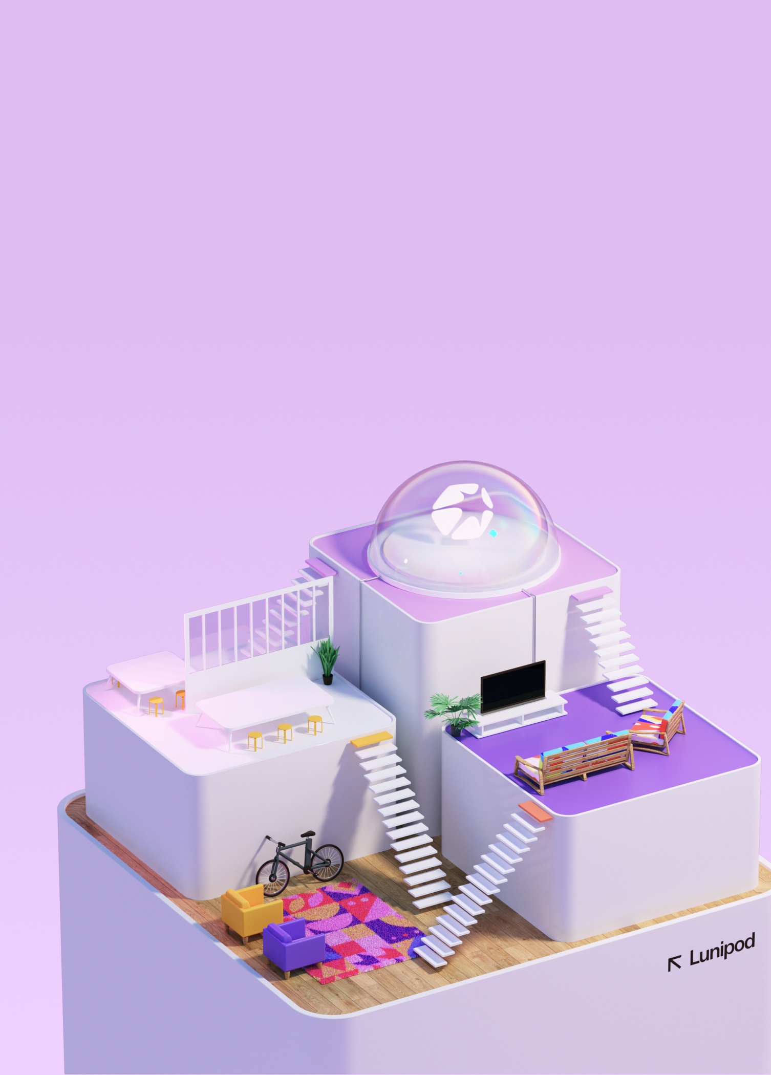
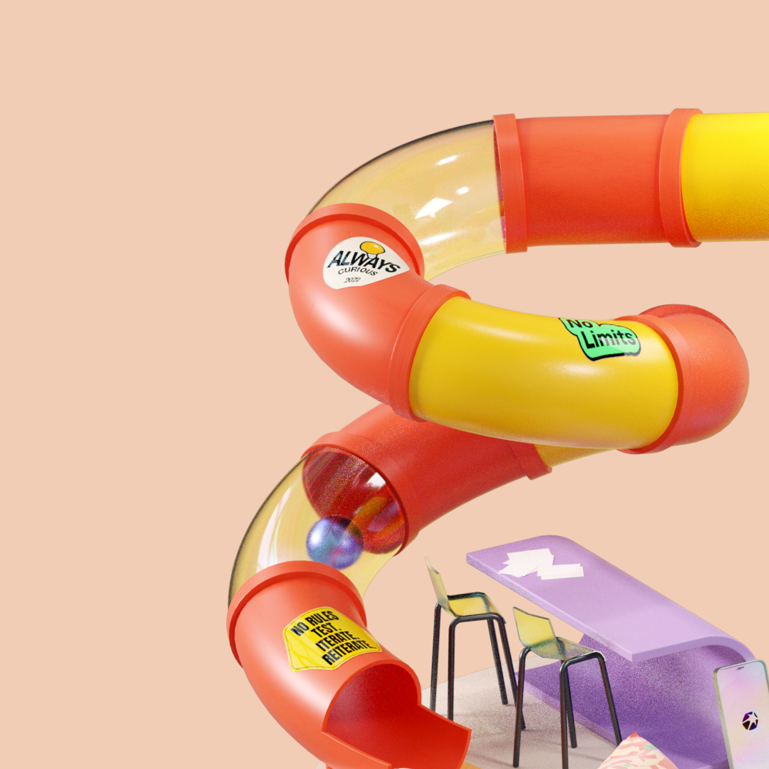
With the Luniverse concept in place, we were able to focus on defining each of its environments or chapters. The Luniverse is composed of 5 environments:
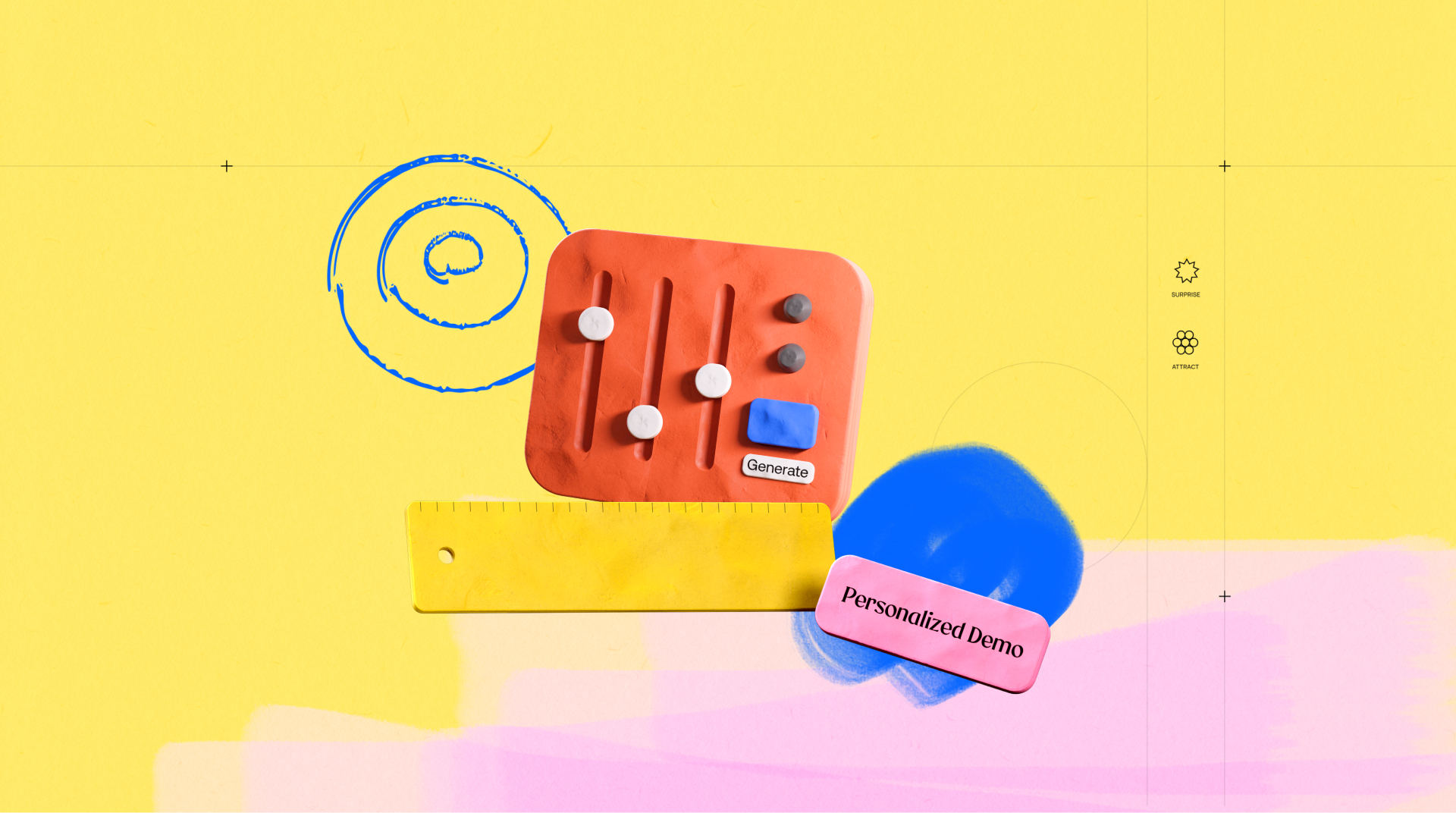
One serving as the entrance, one for each of Luni's three flagship applications (Omada, Spark, and Coach+) and finally, one named Kitchen Lab, which offers a glimpse into Luni's creative universe.
The work on these environments occurred in two phases:
An initial phase of general concept and sketching, which ensured consistency among the various environments.
Followed by a production phase: modeling and texturing in C4D with the Octane rendering engine, and then optimization for integration on the website in WebGL by the development team under Hervé's oversight.



Little big details
To enhance the appeal of the Luniverse and ensure the immersive feeling for visitors, we developed an entire language of micro-interactions. Recognizable and predictable to the visitor, these micro-interactions act as the glue that binds the Luniverse together, ensuring a cohesive experience throughout the navigation.These micro-interactions are the kind of infinite small details that allow grand stories to come to life.




From small to large screens... and vice versa.
From the very first sketches, we knew that the experience we had to create should be as compelling on mobile as it is on desktop.
The quest for consistency across all devices was a guiding principle in our work, from the sketching and modeling phases to micro-interactions, 3D model optimizations, and finally development, all the way to the website's launch.

