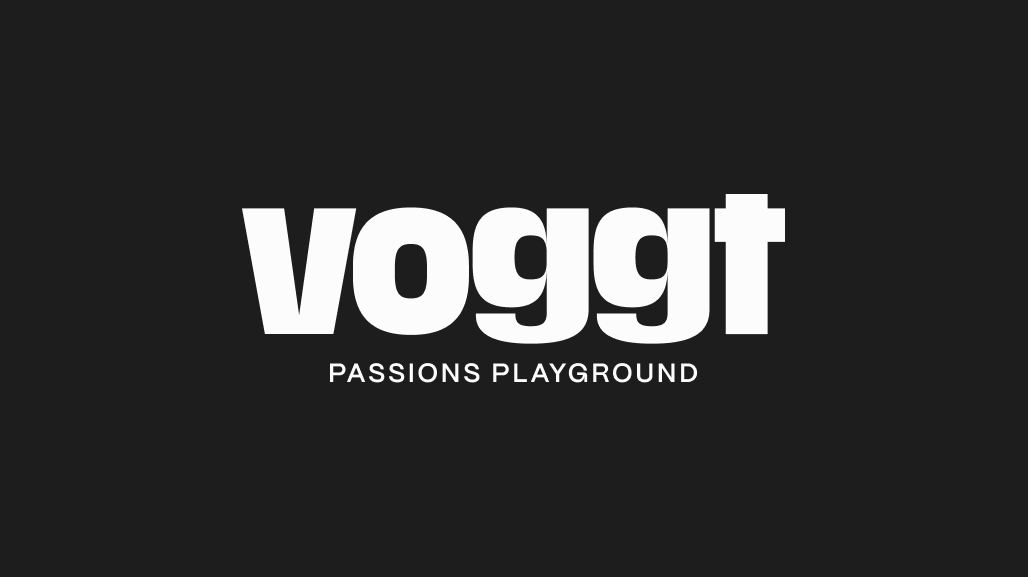
Voggt
The first passionate commerce platform where communities transact and socialize. For the change of name from Bits to Voggt, we carried out a complete rebranding.
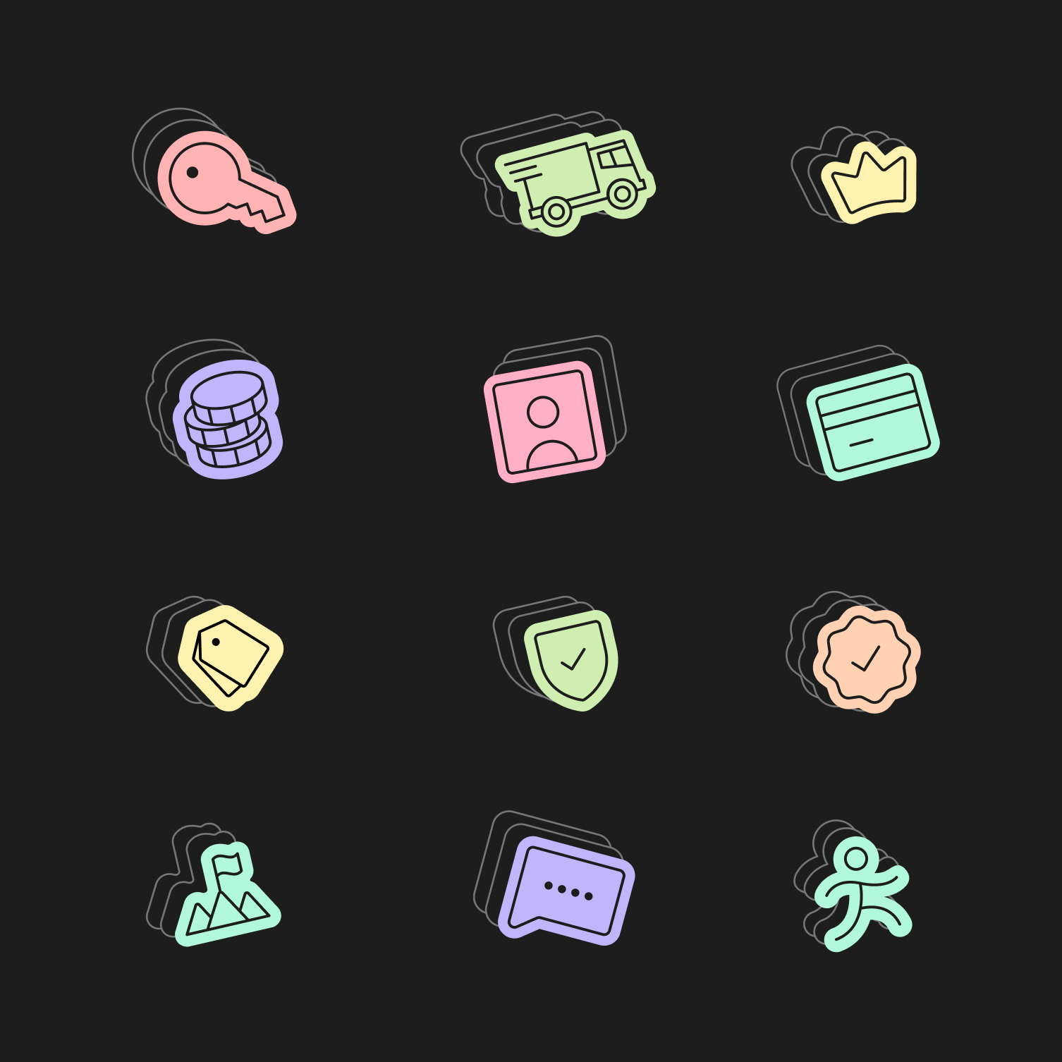
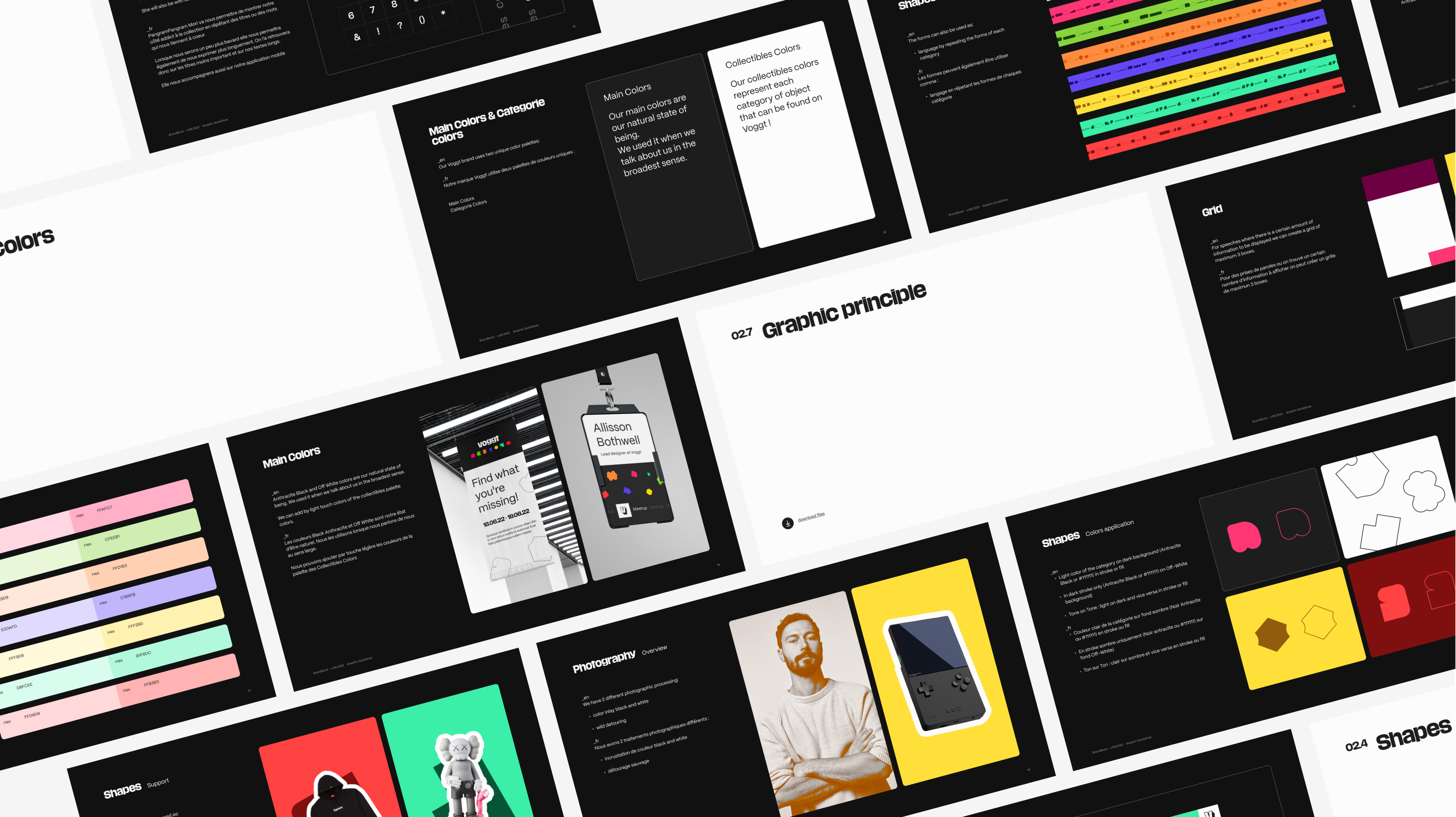
6 fundamental graphic elements
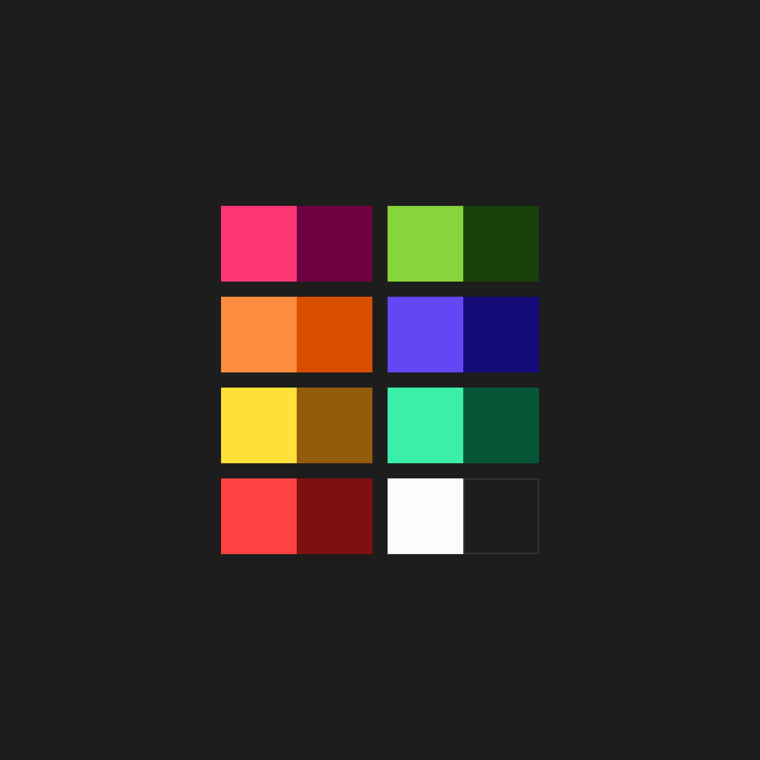
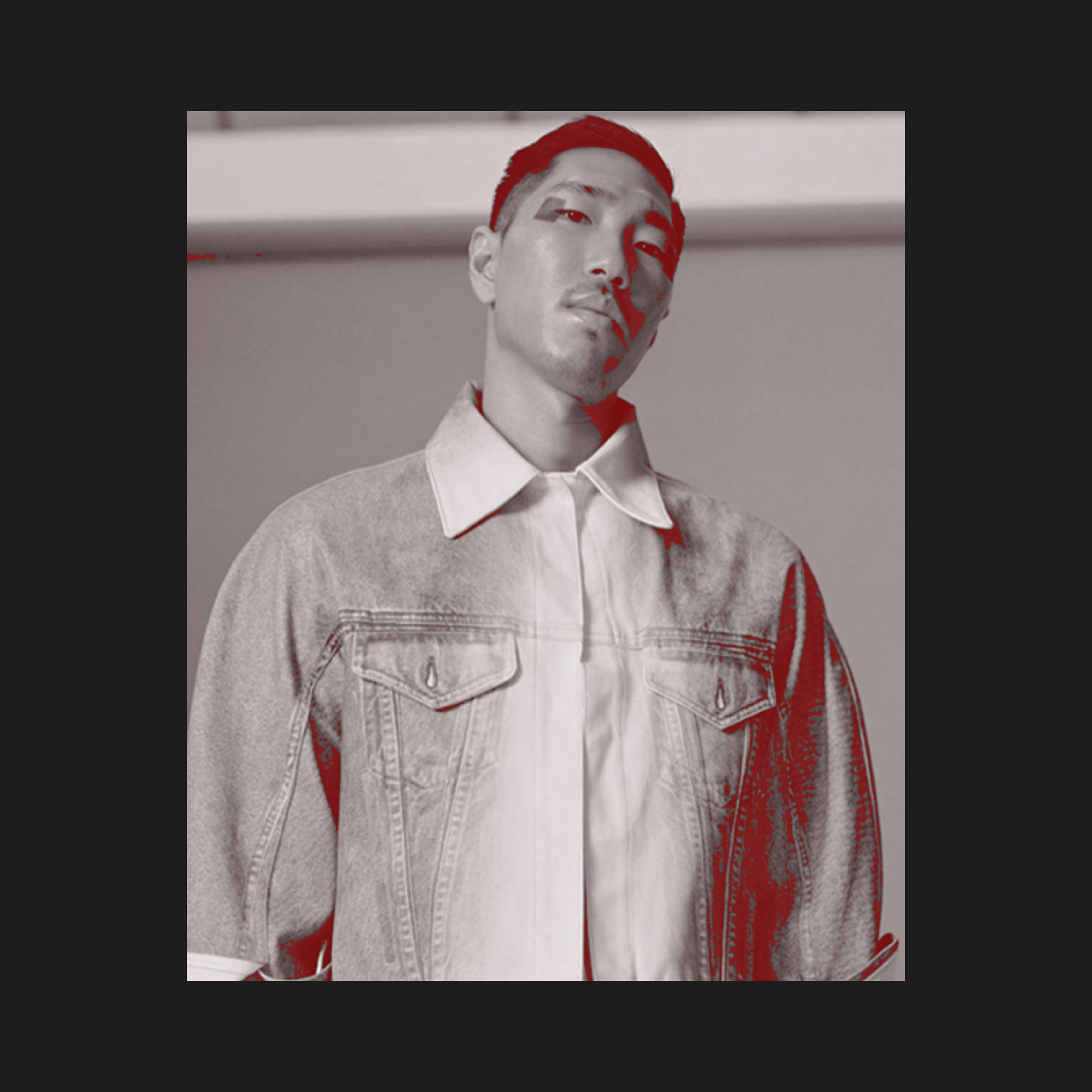
There are six graphic pillars that come together to bring Voggt's new branding to life: impactful logo, unique shapes, repetition of elements, vibrant colors, bold typography, and recognizable photo treatment.


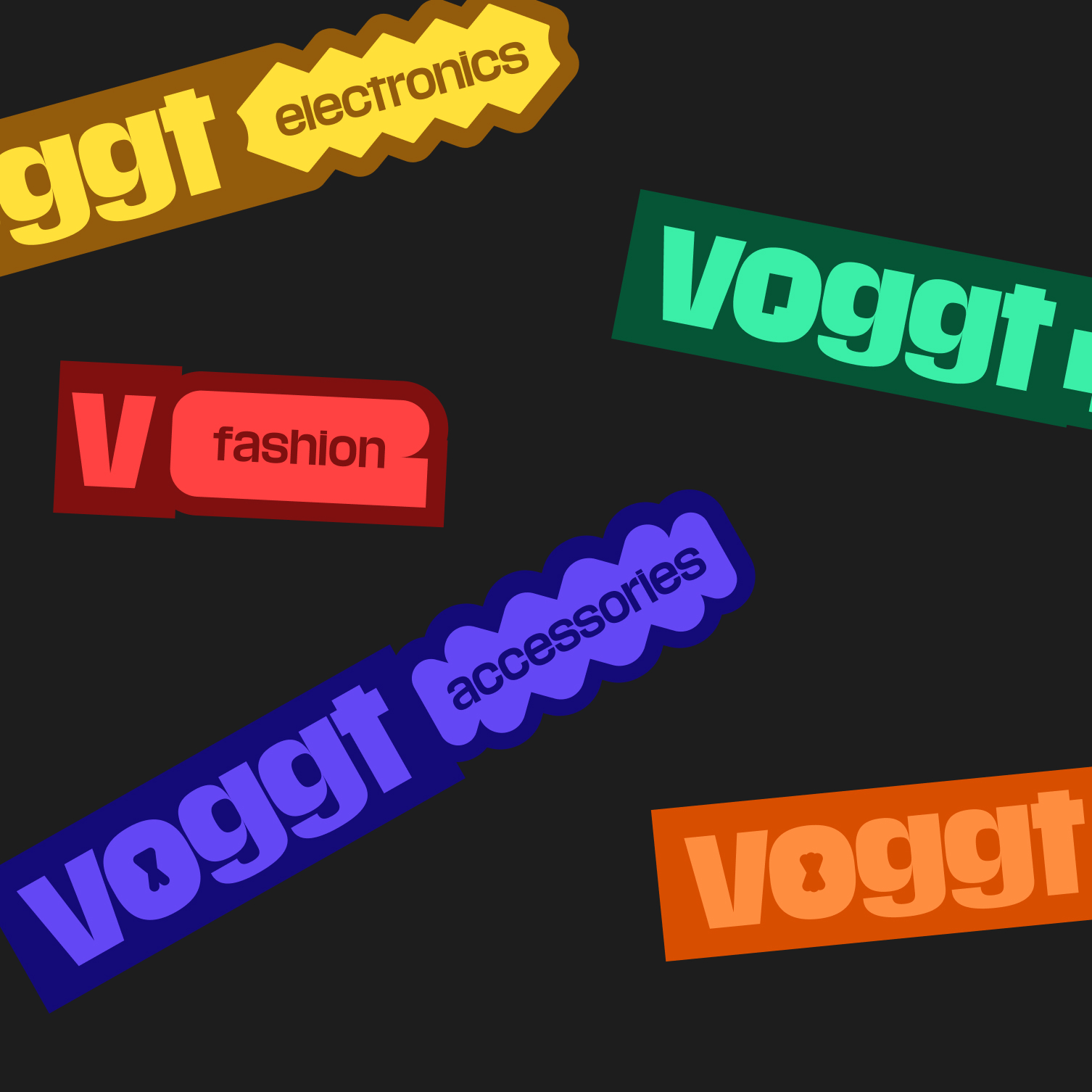
Differents logos
We created several logo variations for different uses, all centered around the same typeface: Media Sans Bold.
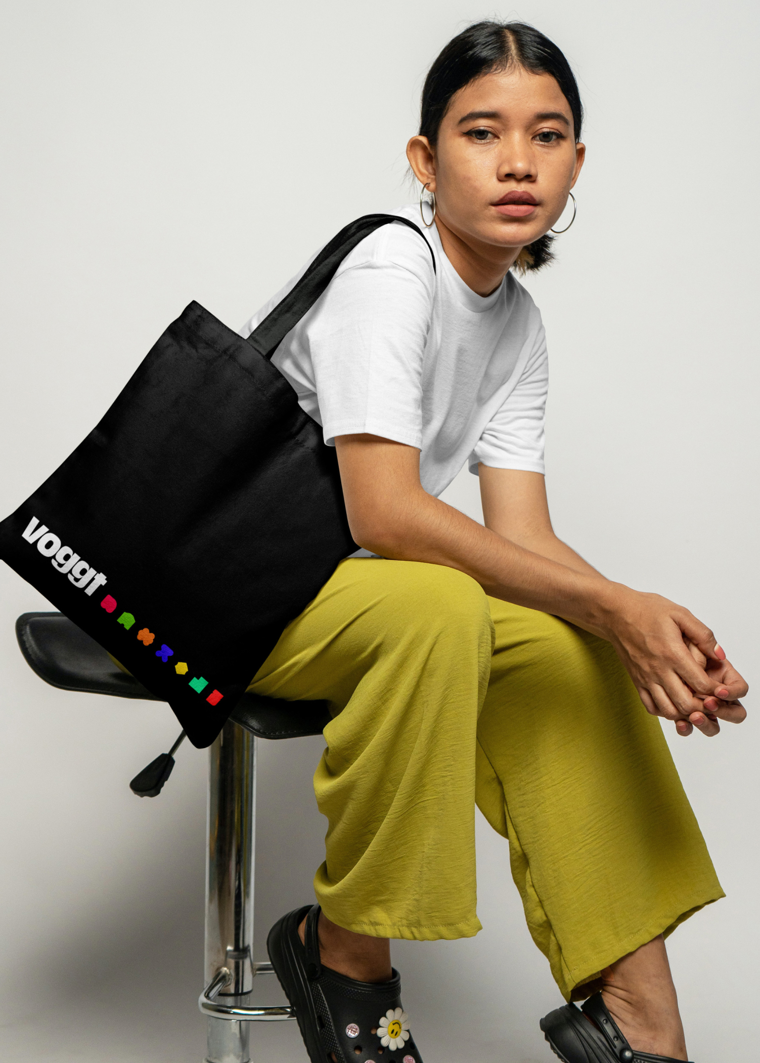
1 st logo : A classic logotype with and without a baseline. In this logo, you'll find several details in each letter that embody Voggt. In the "V," you can recognize cards being held by a person. The negative space in the "O" allows us to insert the shape corresponding to each category of items found on Voggt.
The "G"s reference the iconic "GG" (Good Game) expression and also resemble moving eyes.
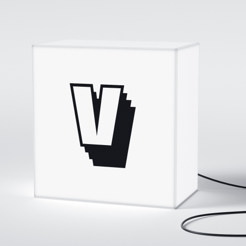
2 nd logo : Deck Monogram Logotype
We created a monogram with the "V" from Voggt, which also embodies the company's values, particularly the act of collecting cards and, more broadly, all kinds of objects, as depicted by the repetition of the shadow of the "V."
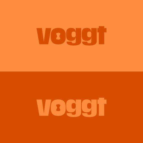
3 rd logo : The classical one
With the negative space of each category and the two associated colors, this emphasizes the concept of a family of collectible objects.
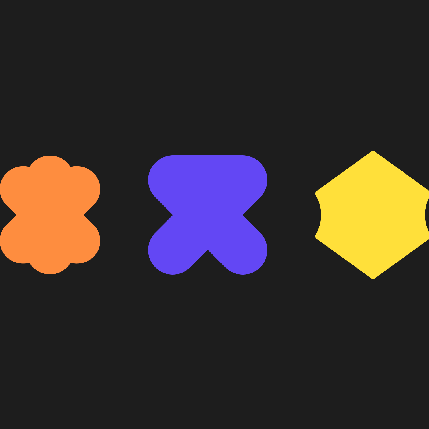
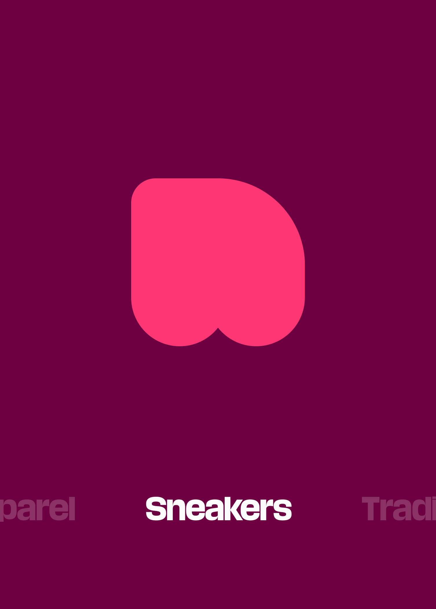
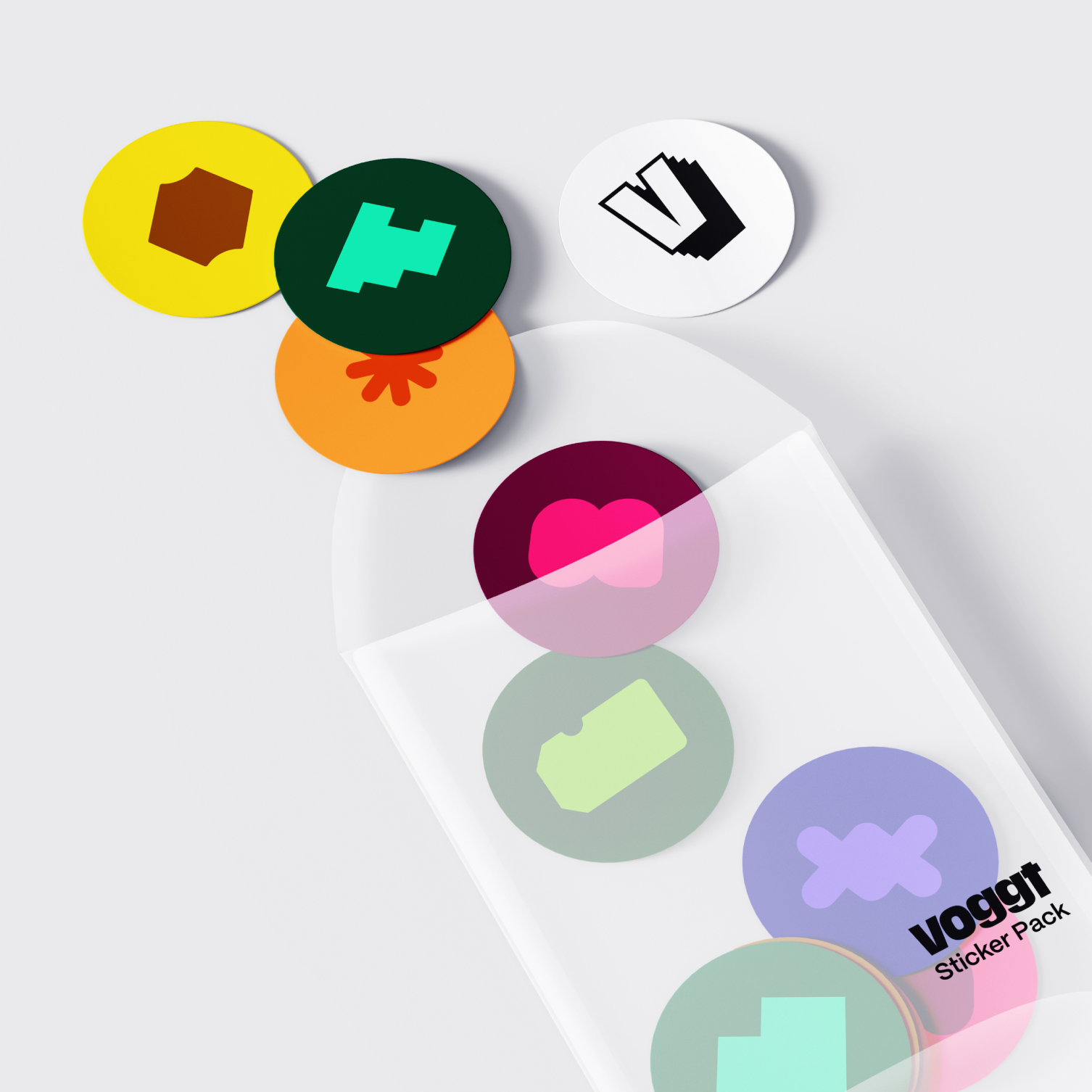
Introducing shapes
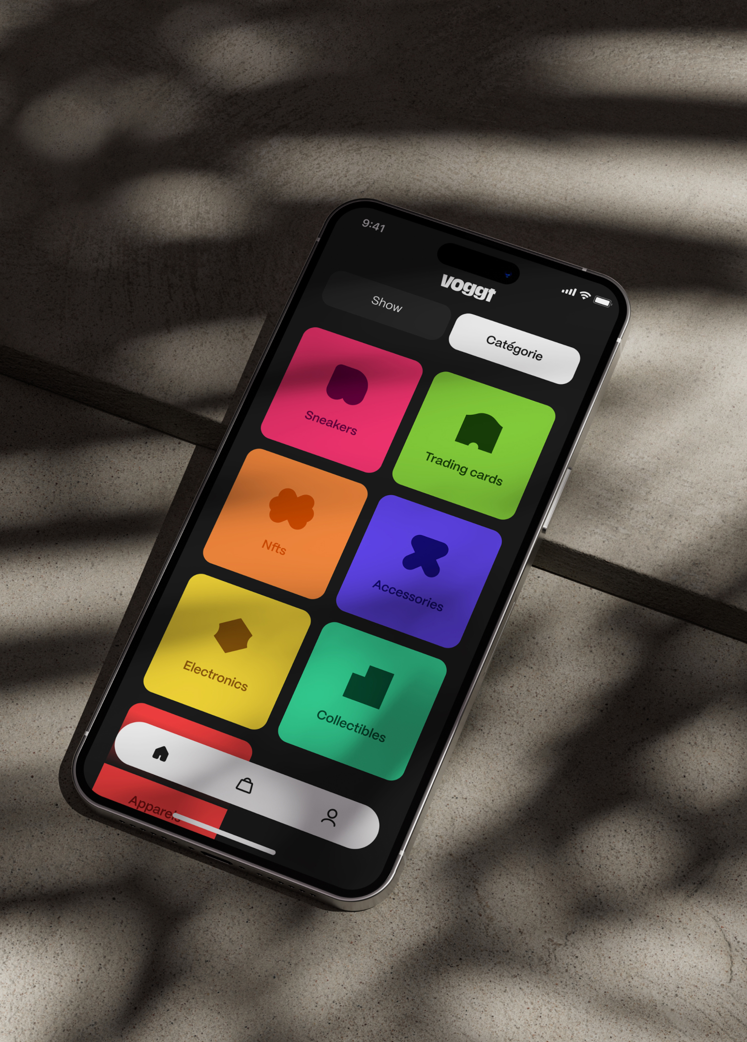
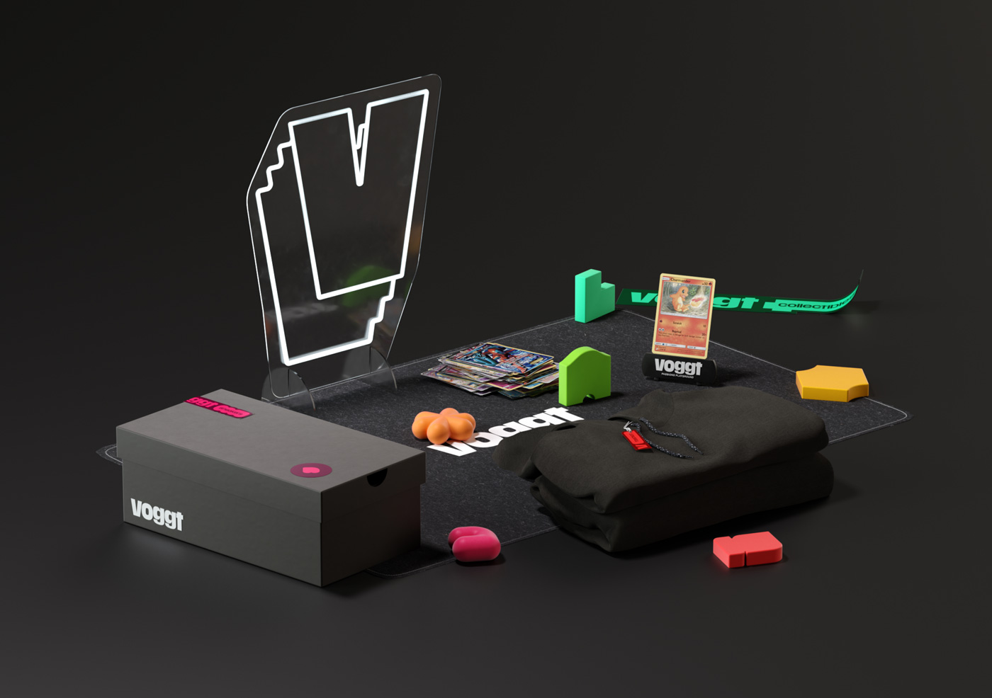
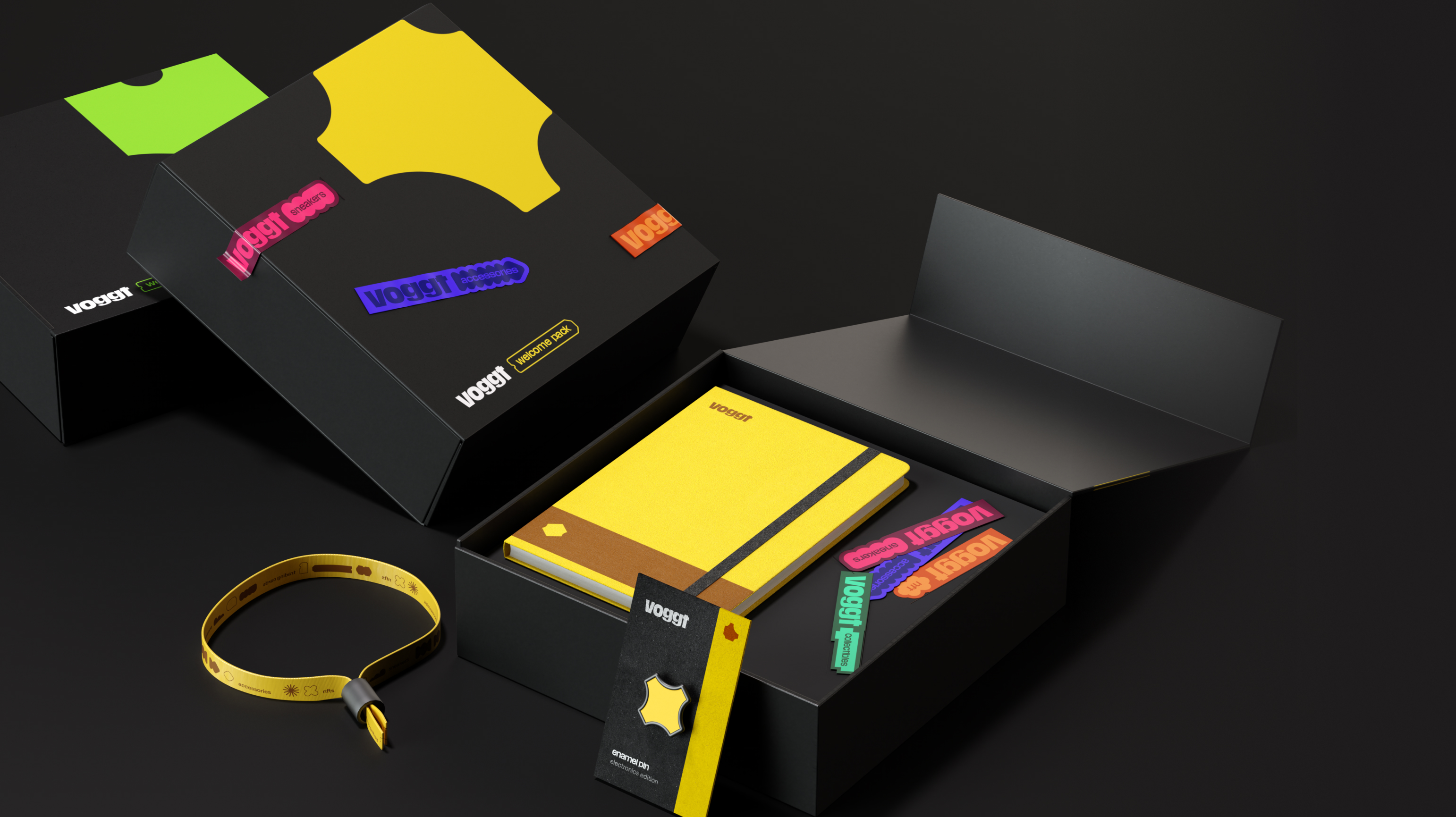
The 7 categories of objects on Voggt are represented by a cool, simple, and distinctive primary shape.
These 7 shapes create 7 families within which variations can be found.This is a way to associate a distinctive and recognizable symbol for enthusiasts, thereby reinforcing the sense of community within Voggt.
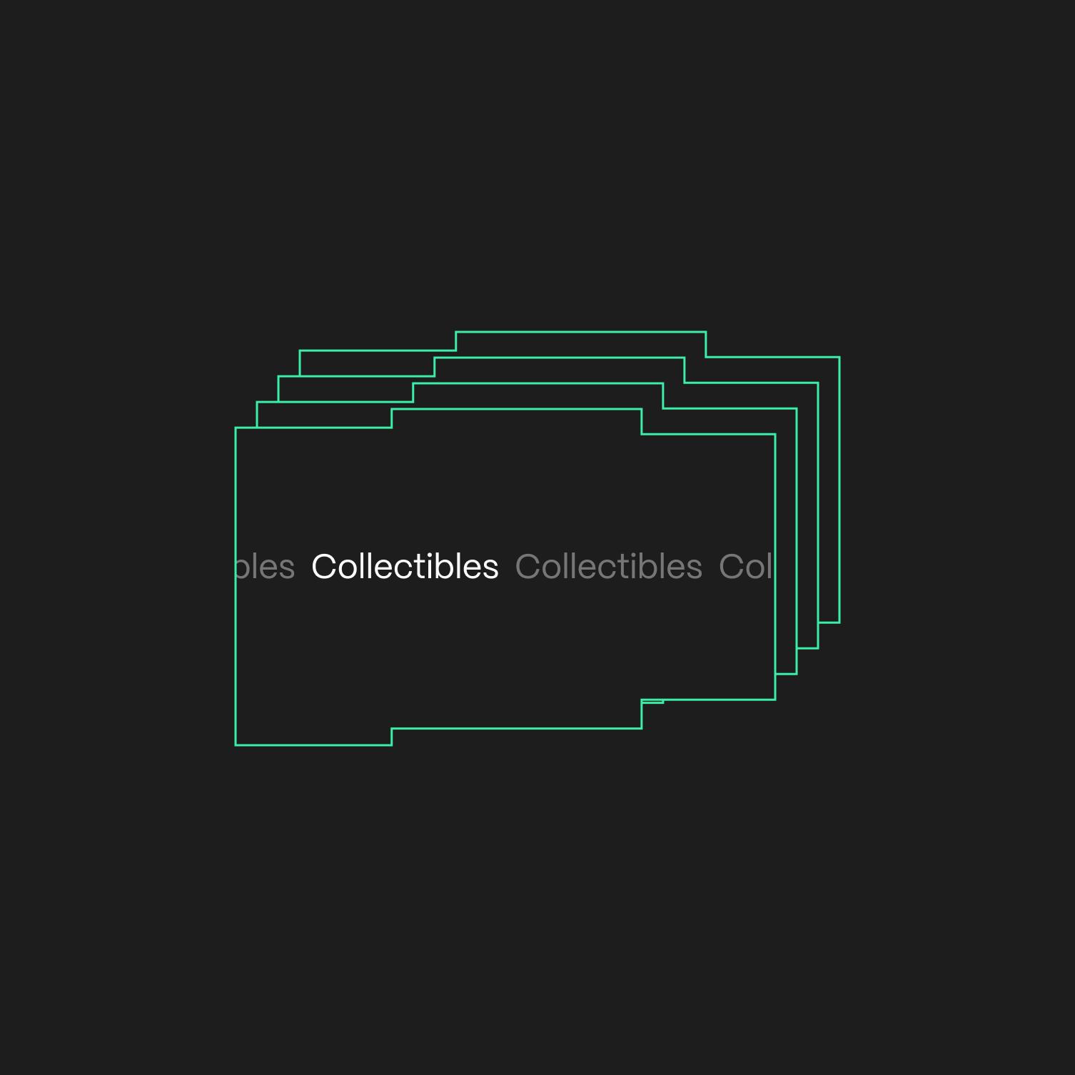
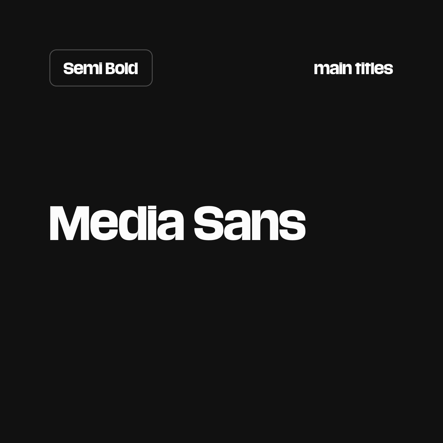
Font we use
The Media Sans and the Media Sans Bold are the typefaces that best embody Voggt.
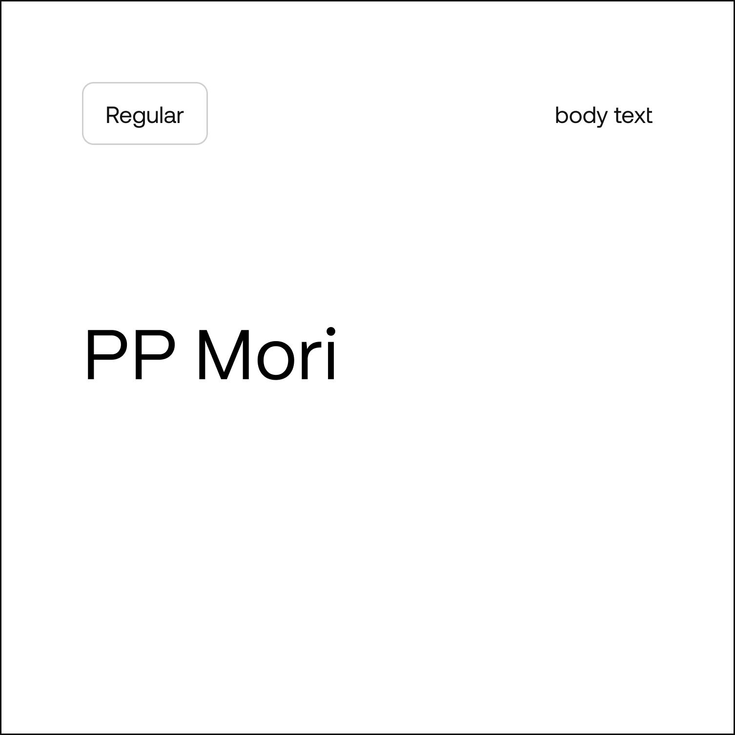
They are used for the most important messages.PP Mori reflects our addiction to collecting by repeating headlines or words that are dear to us.It also allowing us to express ourselves at greater length. You will find it on less important headings and in longer texts. It is also used for the mobile application.
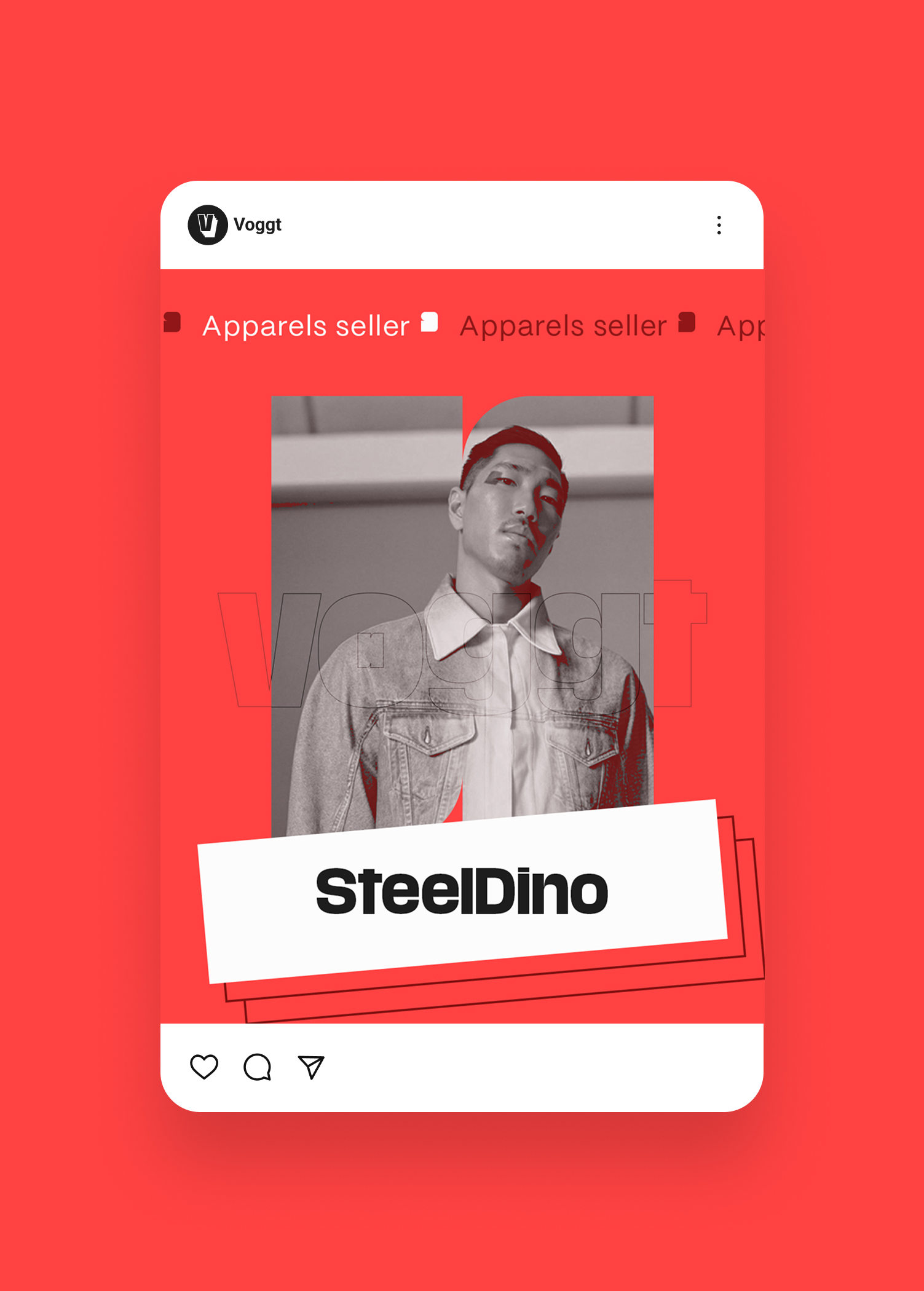
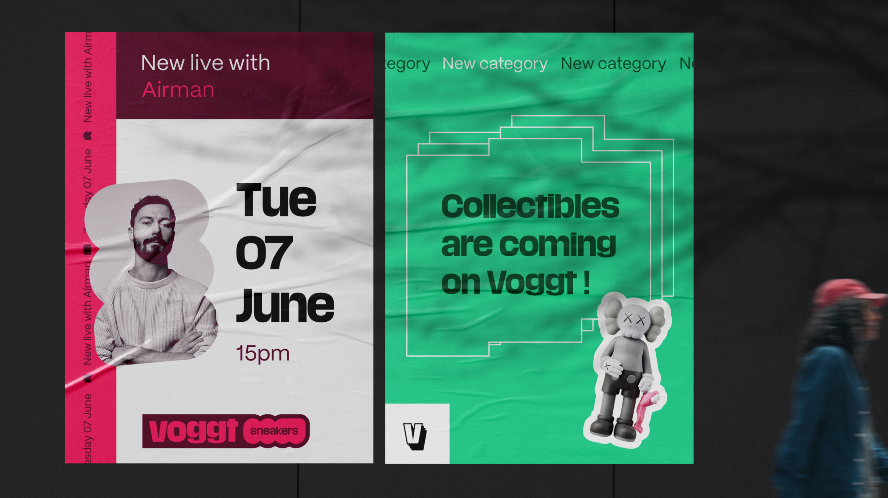
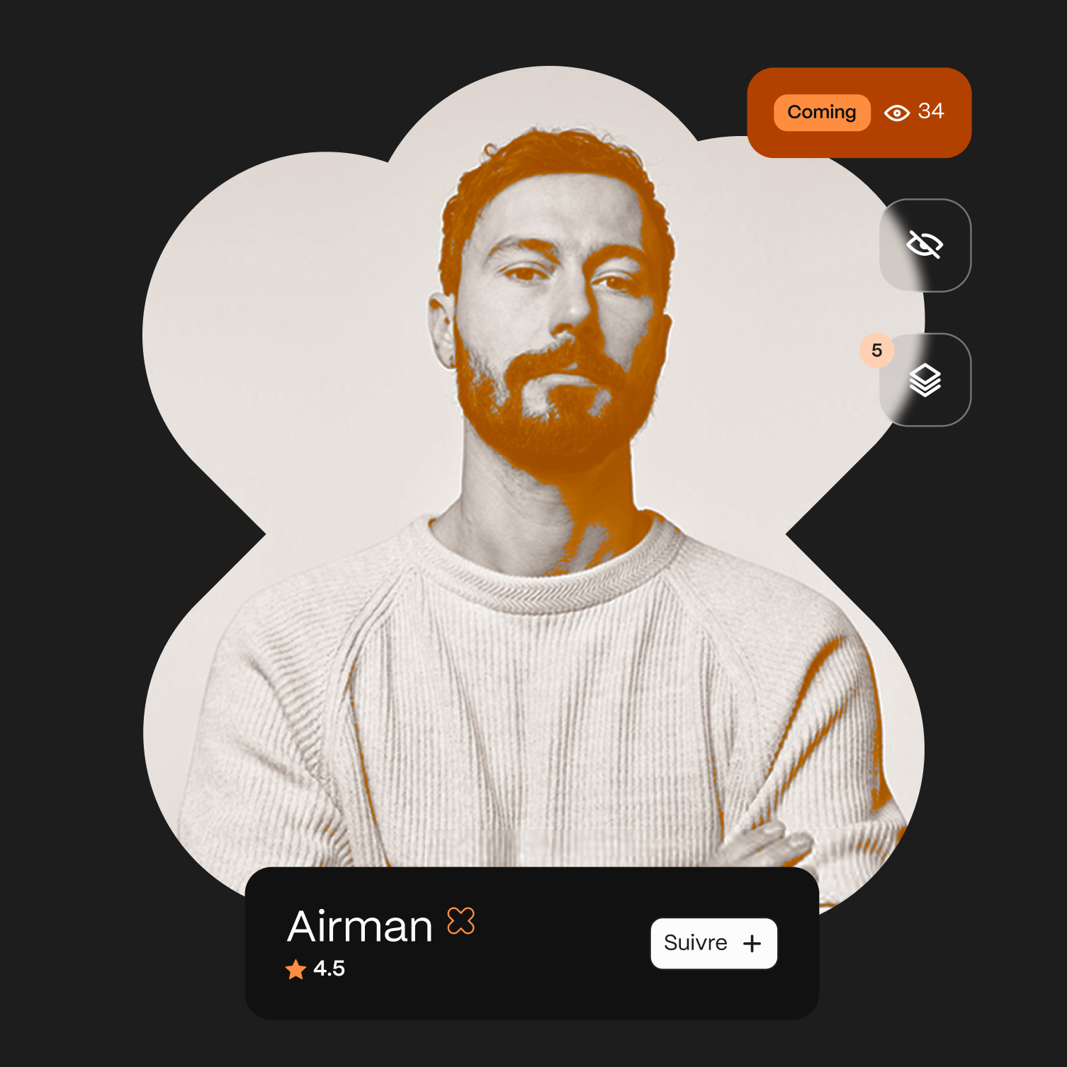
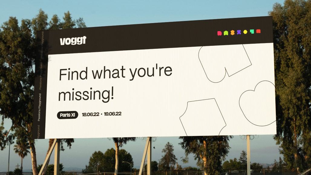
App
To ensure that the message conveyed by the brand remains consistent throughout the user experience, we worked on key screens for the mobile and web application used by buyers, as well as the Seller Studio designed for sellers.