Pimento

Laying the foundations of a brand built to free creativity.
Industry
Creative platform
Year
2024
Touchpoints
Brand identity
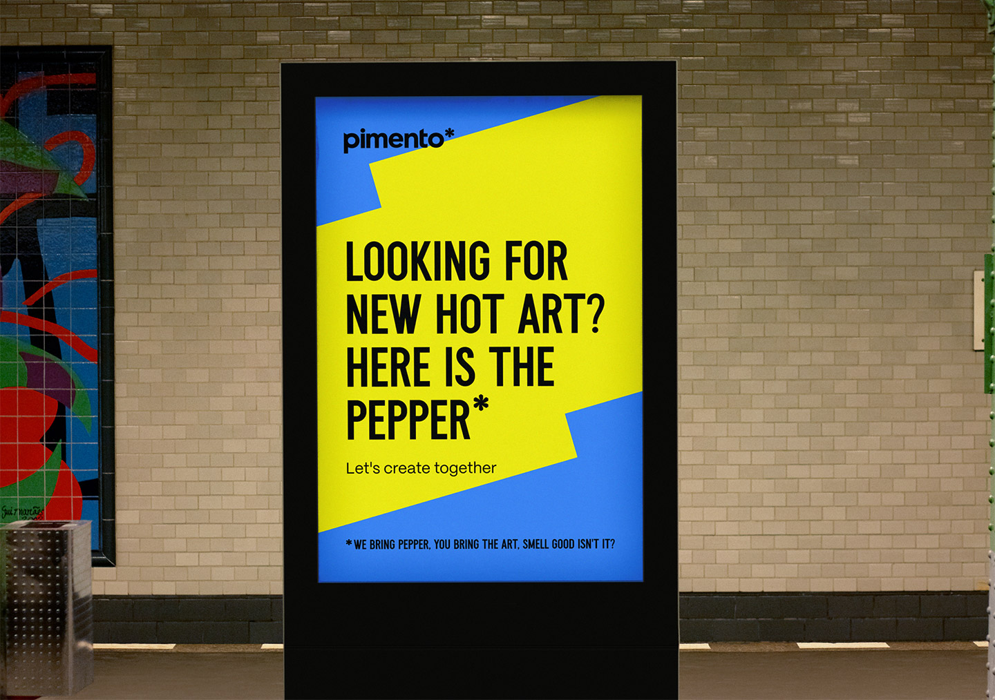
Pimento — the street poster: “Looking for new hot art? Here is the pepper*”

Pimento speaks to creative minds who want to explore their graphic DNA freely, and aims to have a positive impact on creativity. Hervé laid out its objectives and founding values, ran the visual explorations and produced the brand’s assets.
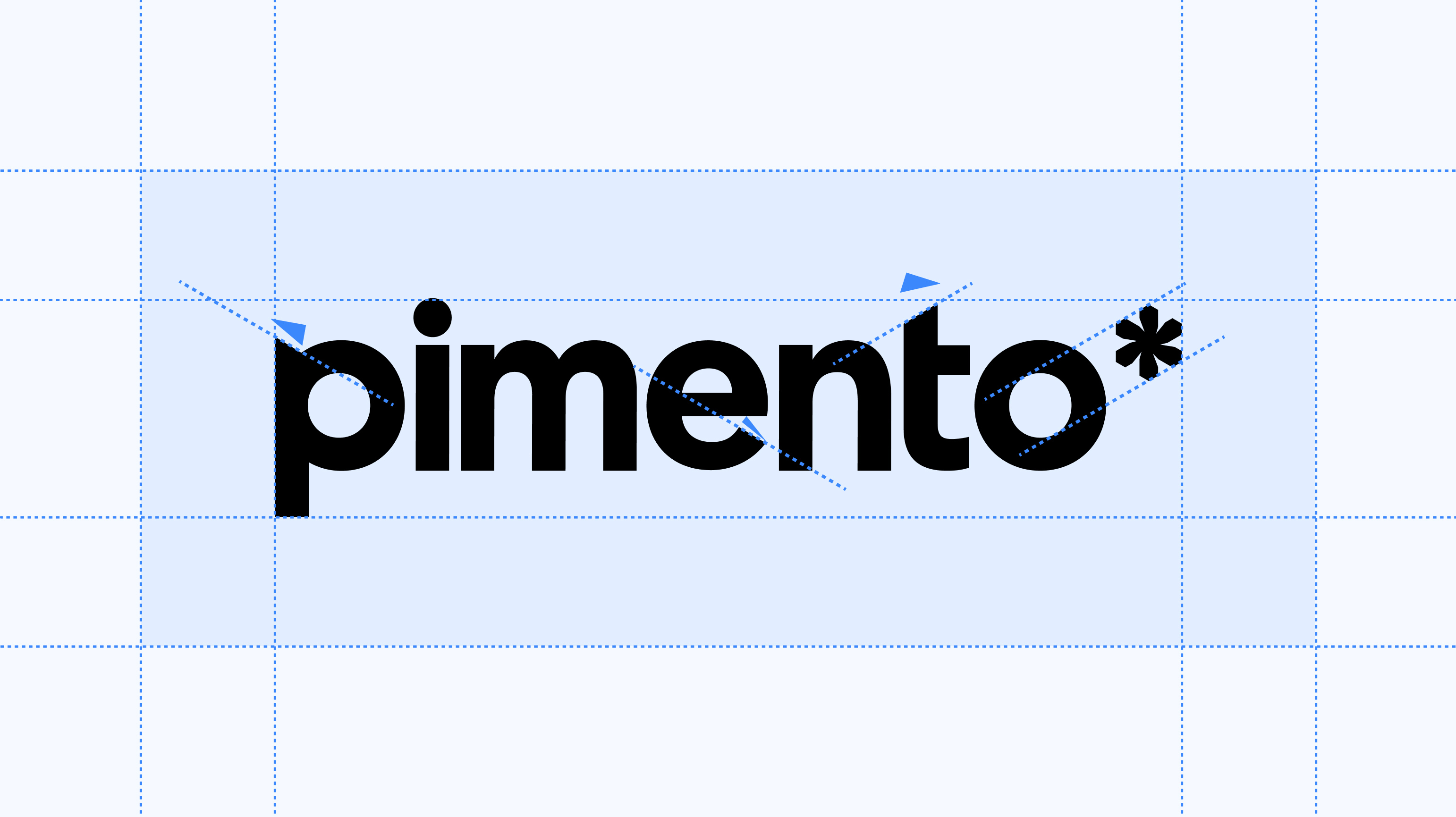

Pimento — the wordmark on its construction grid
Pimento — the brand's asterisk, black on yellow
Pimento — the wordmark in white on black
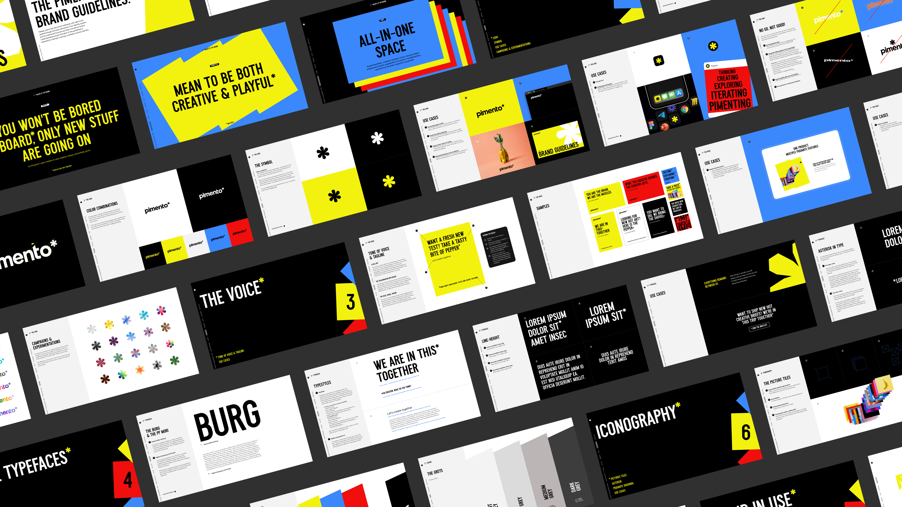
Pimento — the brand guidelines pages, black, yellow, red and blue

More is better

Laying out the objectives of Pimento, identifying the founding values, visual explorations, and production of the necessary assets for the creation of a brand that aims to have a positive impact on creative minds...Hervé mobilized his expertise to meet a significant challenge: giving an identity to a company determined to make the lives of creatives richer in explorations!
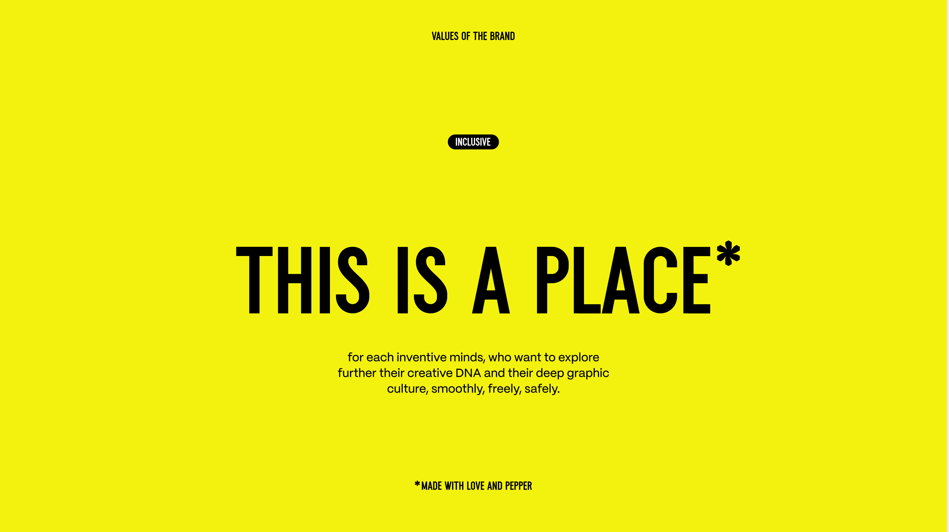
Pimento — the statement “This is a place*” on yellow
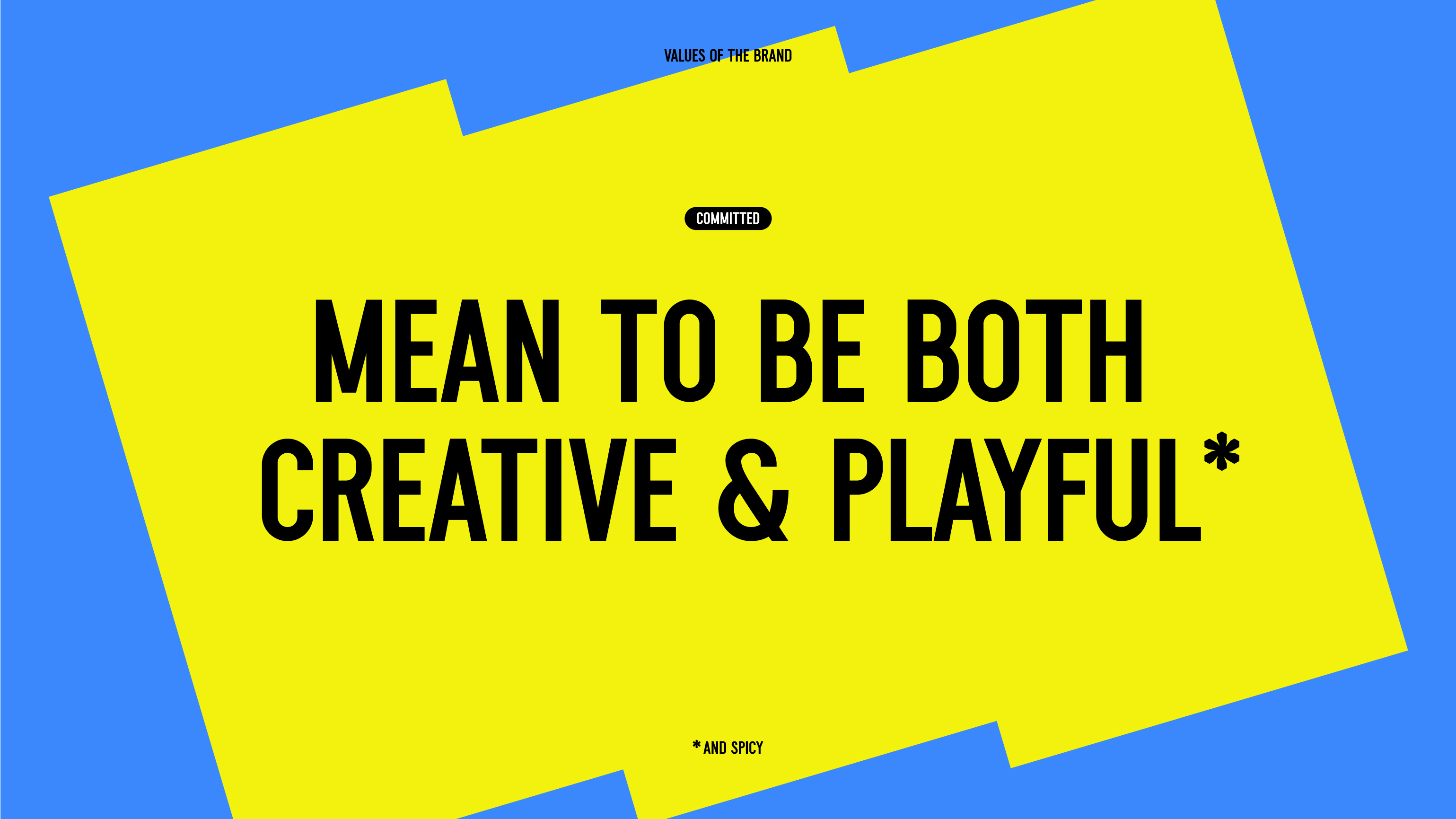
Pimento — “Mean to be both creative & playful*”, yellow on blue
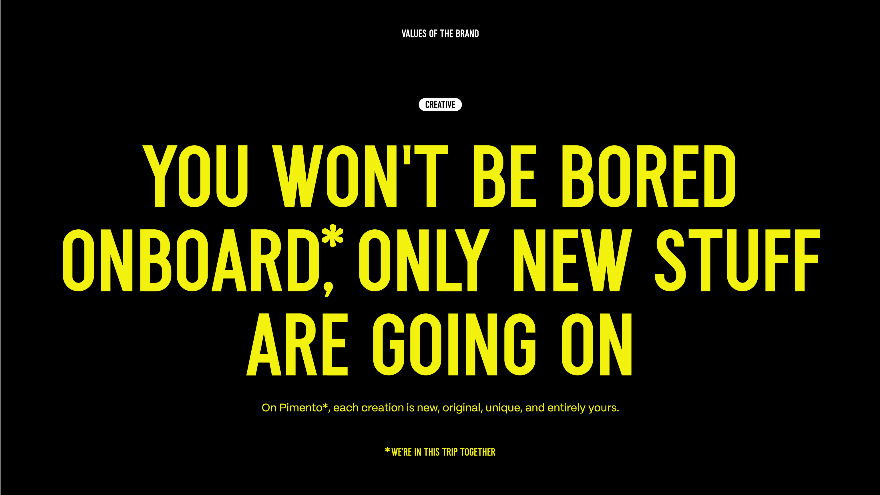
Pimento — “You won't be bored onboard*”, yellow on black
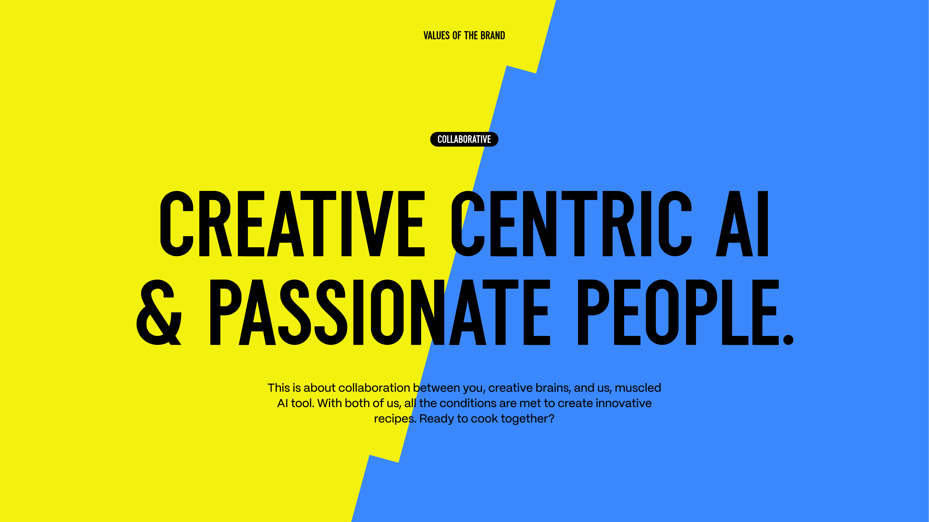
Pimento — “Creative centric AI & passionate people”, in yellow and blue
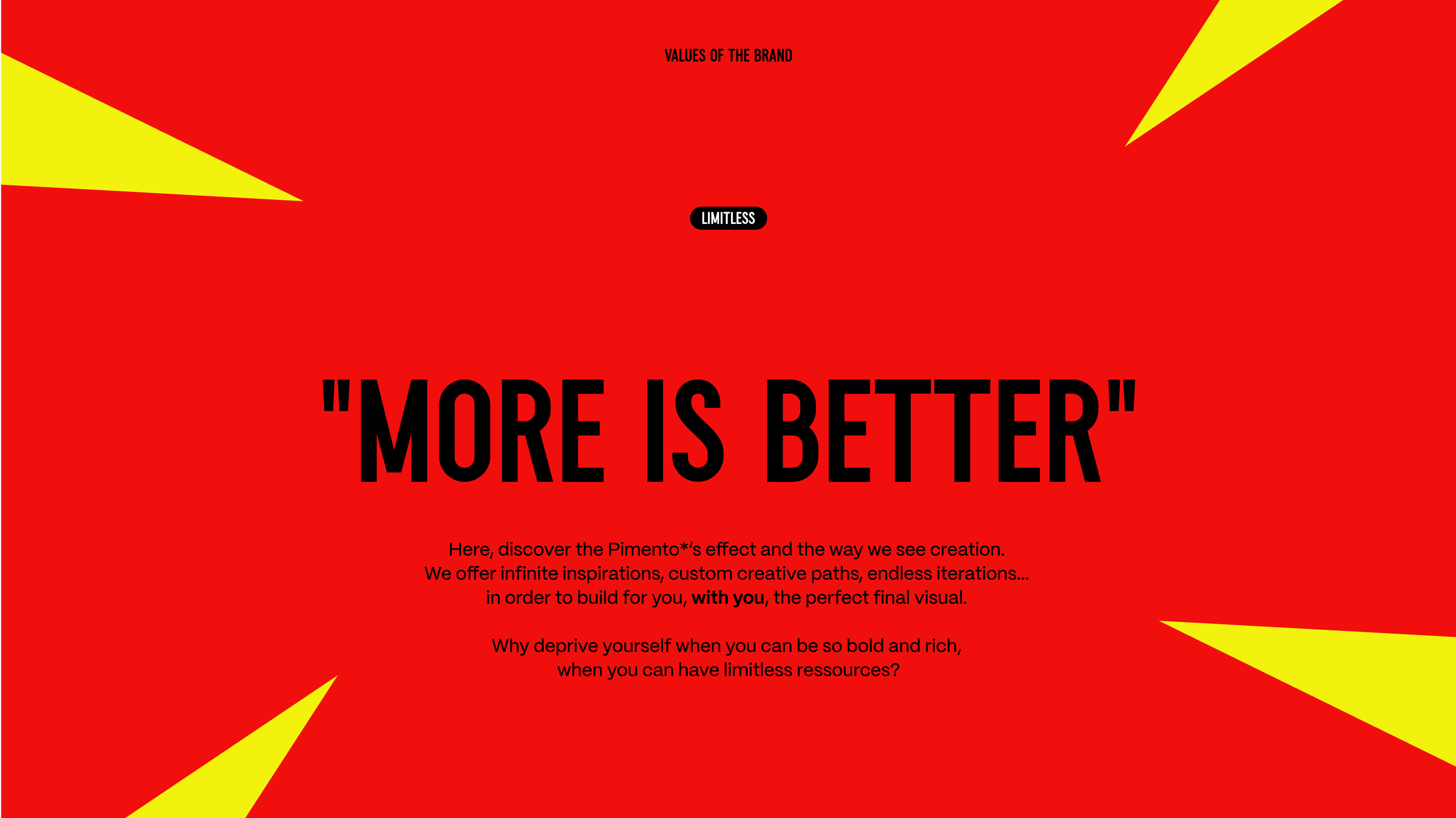
Pimento — “More is better”, black on red
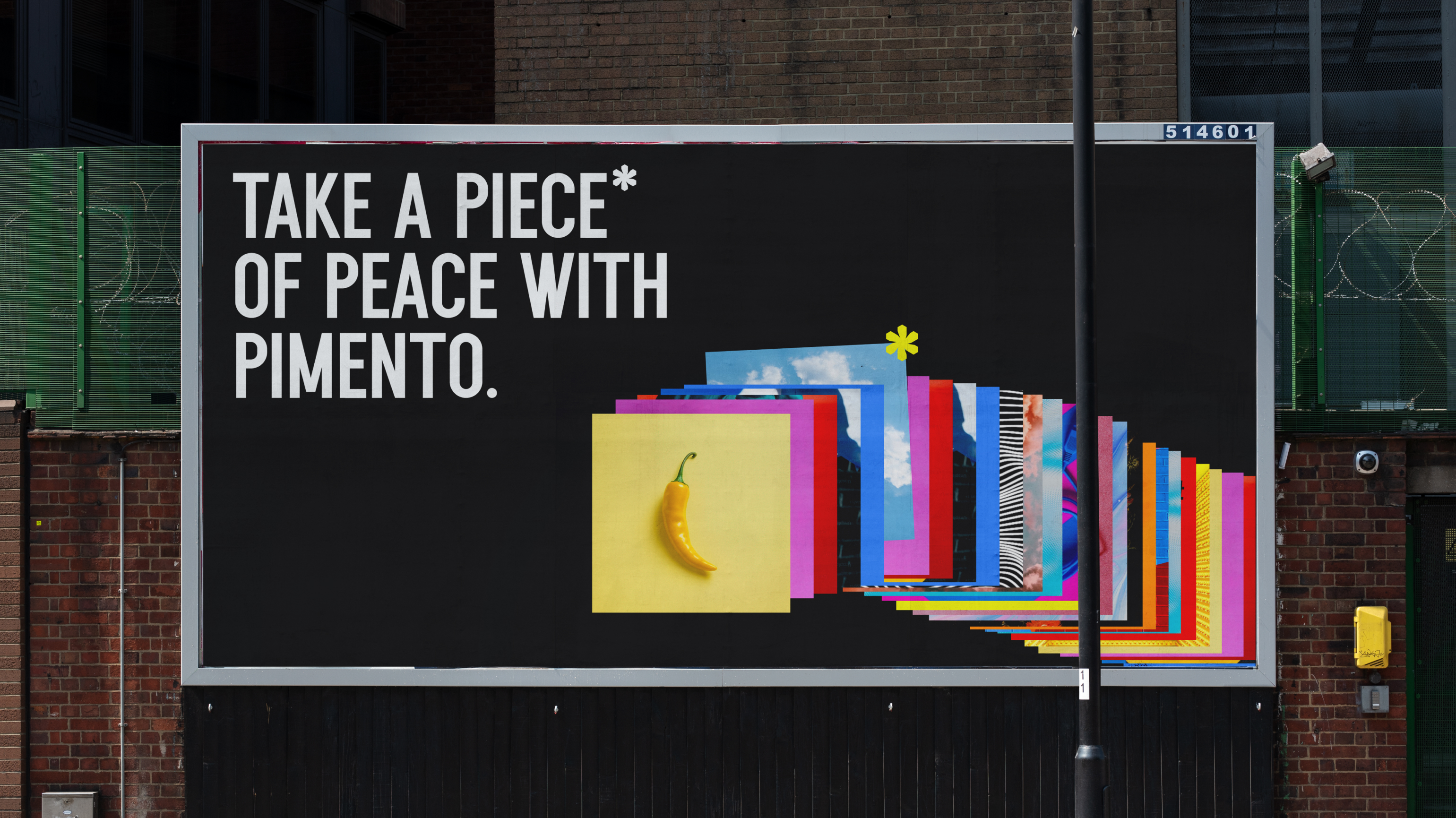
Pimento — the “Take a piece of peace with Pimento” poster on a brick wall
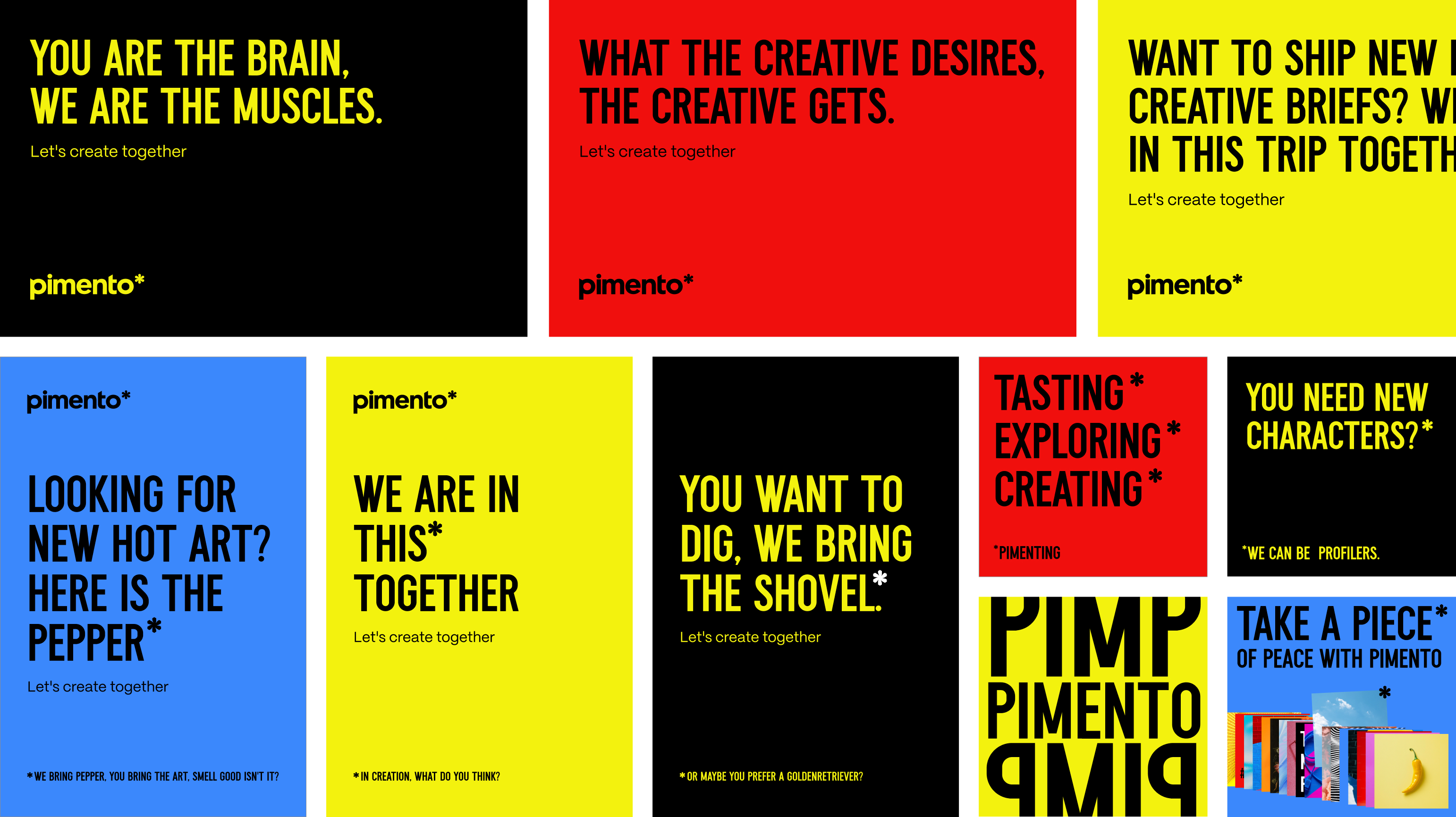
Pimento — the grid of taglines: “You are the brain, we are the muscles”…
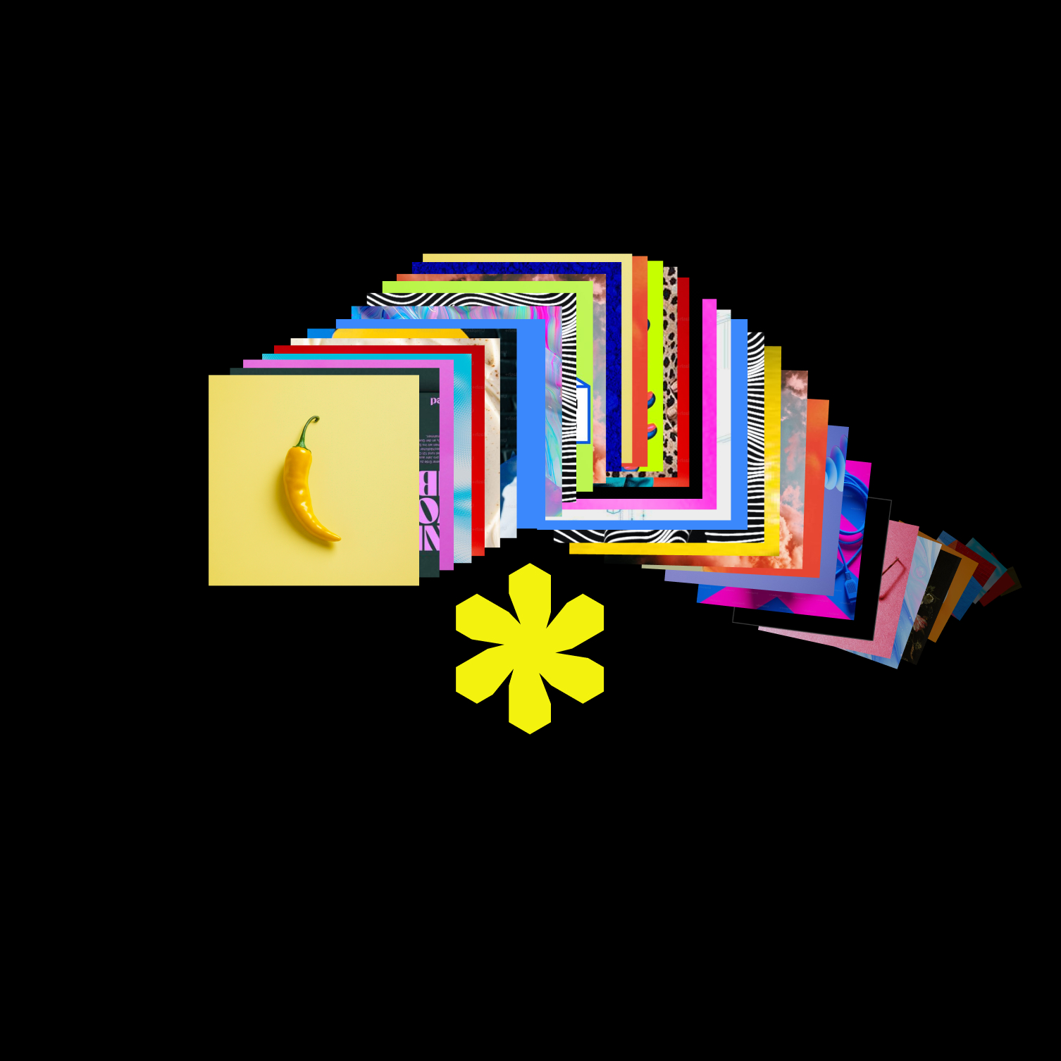
Pimento — a fan of colourful cards, a pepper and the asterisk
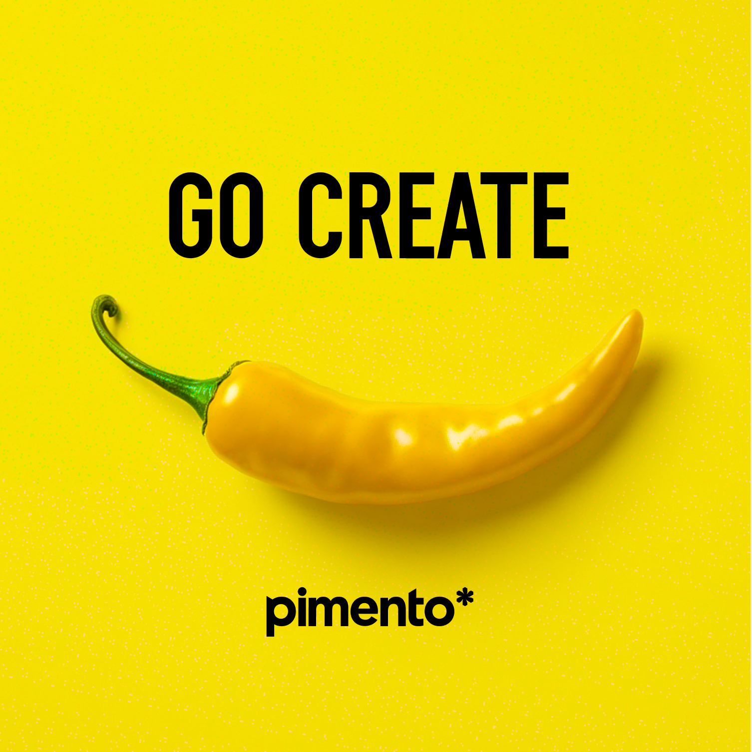
Pimento — “Go create” and a yellow pepper on yellow
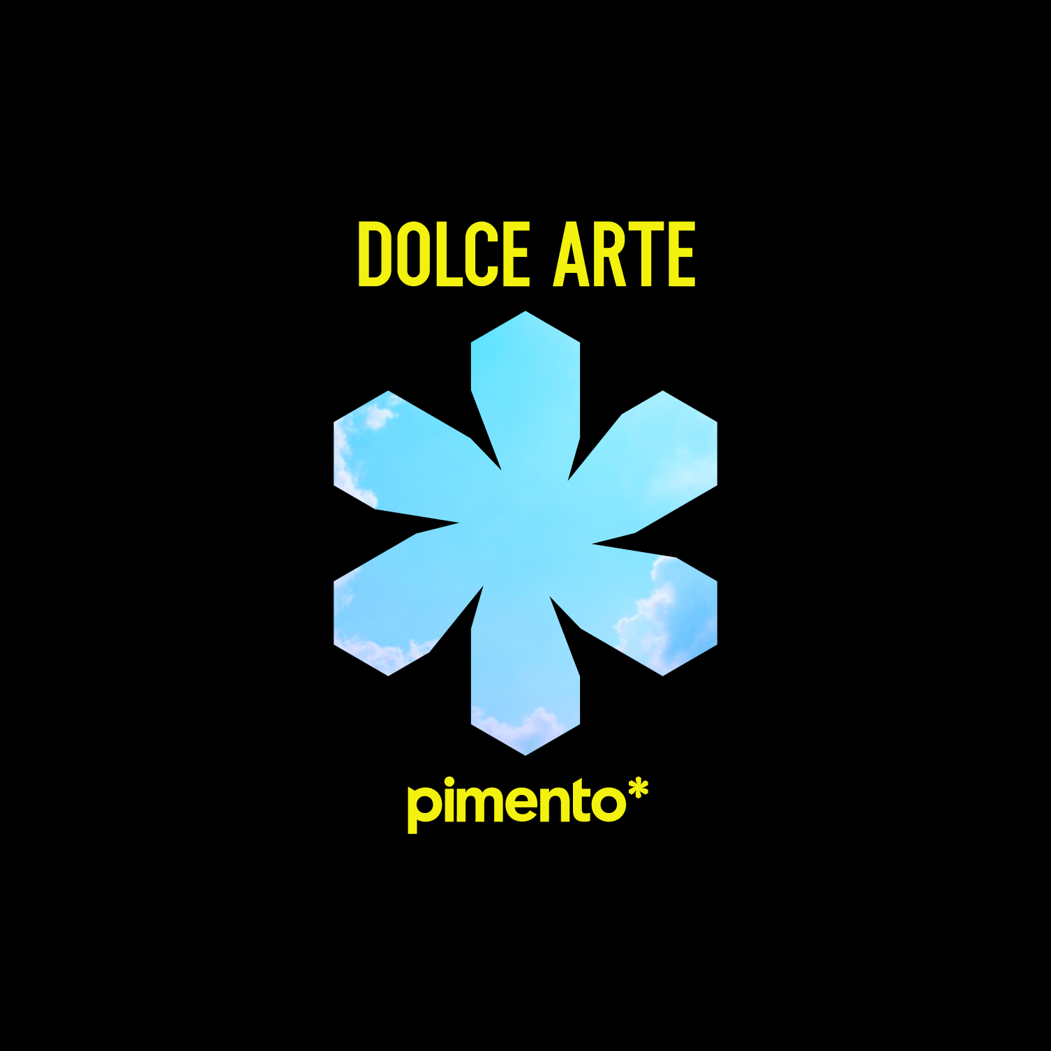
Pimento — “Dolce arte” and the blue asterisk on black
Pimento — a portrait cut out on the brand's yellow, beneath the word “New”
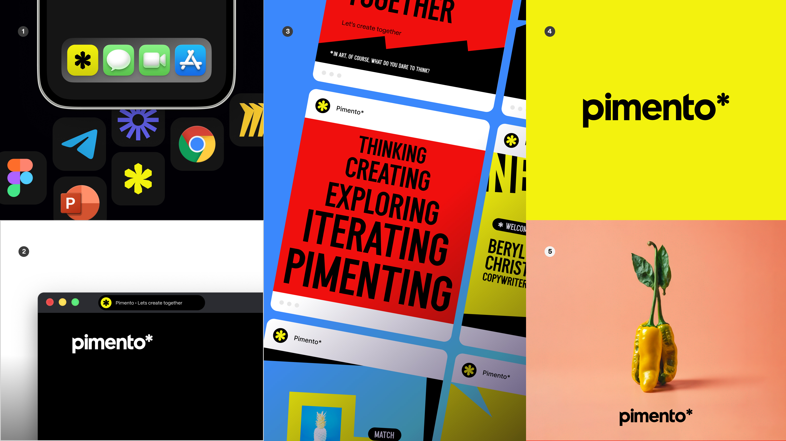
Pimento — app icons, posters and a yellow chilli on pink