Scalingo
A new brand for an ambitious European PaaS scaling up to to take on the American hyperscalers.


Insight
Taking on the Hyperscalers
In interviews, users kept coming back to Scalingo’s support: technically impeccable, transparent, responsive, and human. Just as importantly, it felt local, part of the same European world as the people using it.
Le véritable élément différenciant de Scalingo n’était donc pas son infrastructure, mais la sérénité qu’elle procurait. Ce changement de perspective est devenu le point d’ancrage de tout le travail de marque.
À partir de là, la direction créative s’est précisée : l’entraide plutôt que l’héroïsme, la vitesse sans le stress, le collectif plutôt que la performance individuelle, et une présence fiable dans un environnement compétitif et exigeant — le tout avec une tonalité résolument européenne.
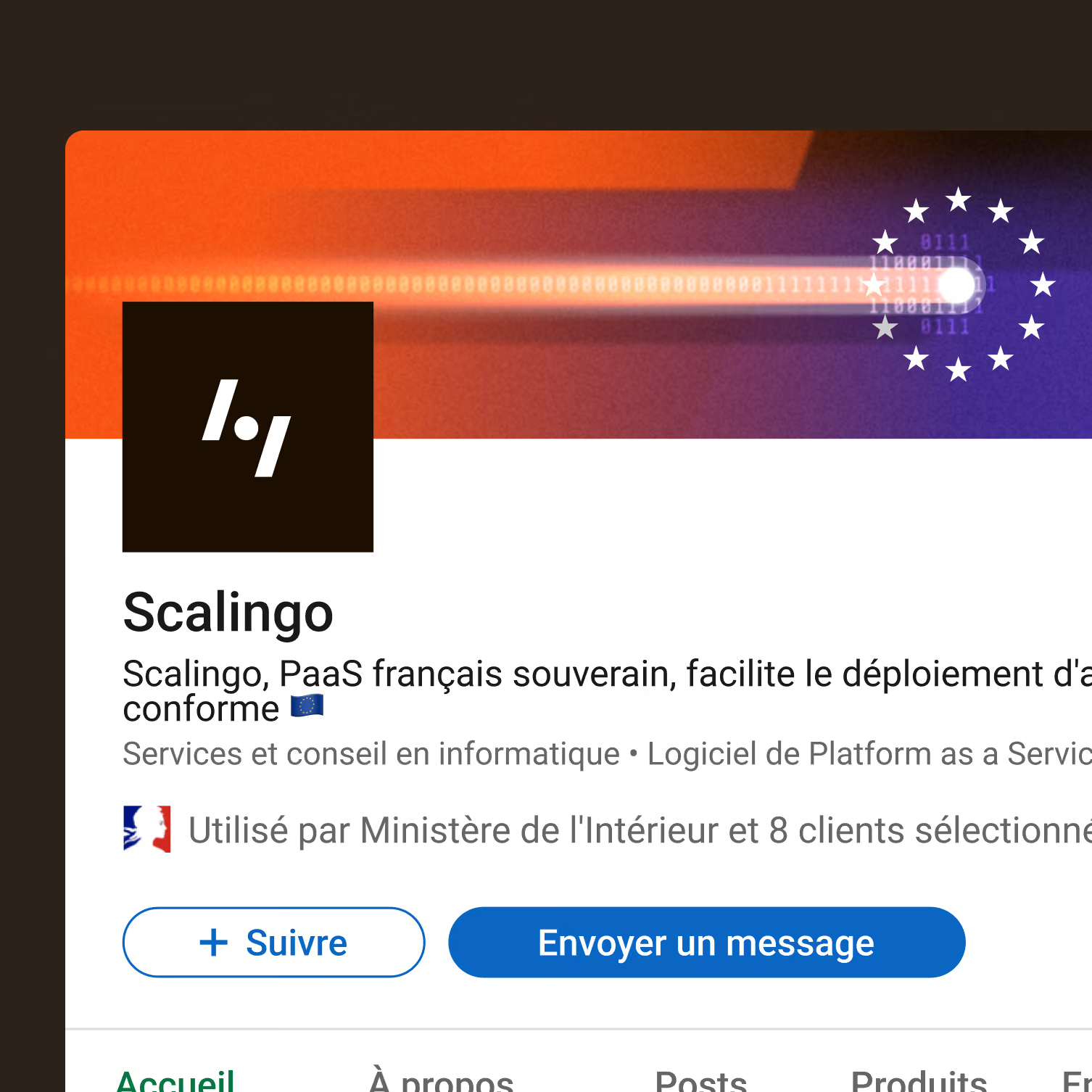

Motif L’Équipier
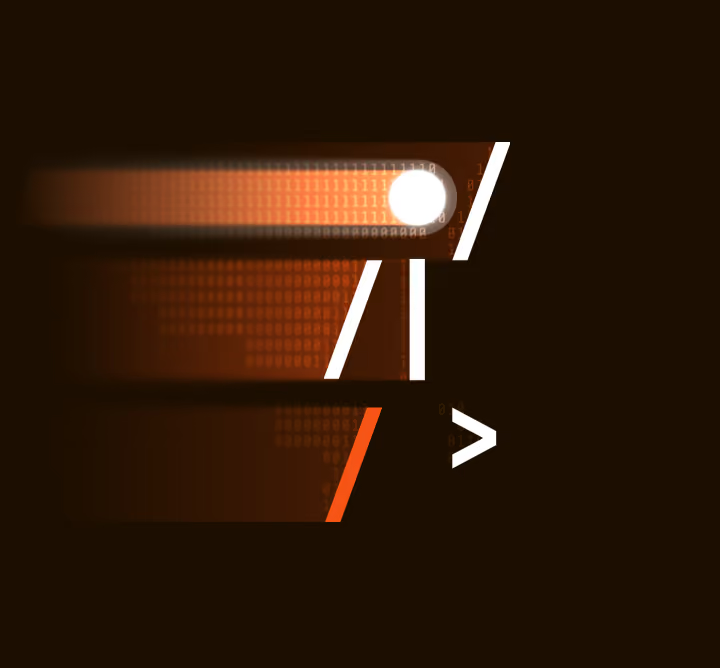
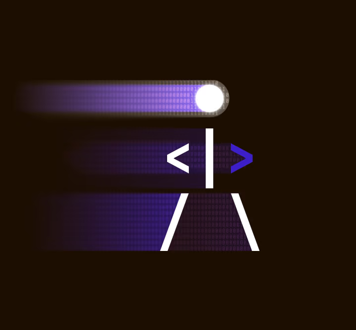
The Motif is an element that gives the brand’s underlying logic a visible centre. For Scalingo, that Motif was l’Équipier: a figure built from ASCII characters in a terminal-style font. It links the world of developer tools to the Tour de France, named after the teammate whose role is support rather than glory.
Typography
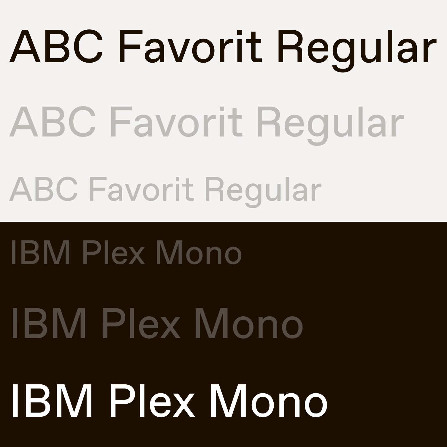
ABC Favorit carries the main brand voice. IBM Plex Mono appears in technical moments, adding precision.
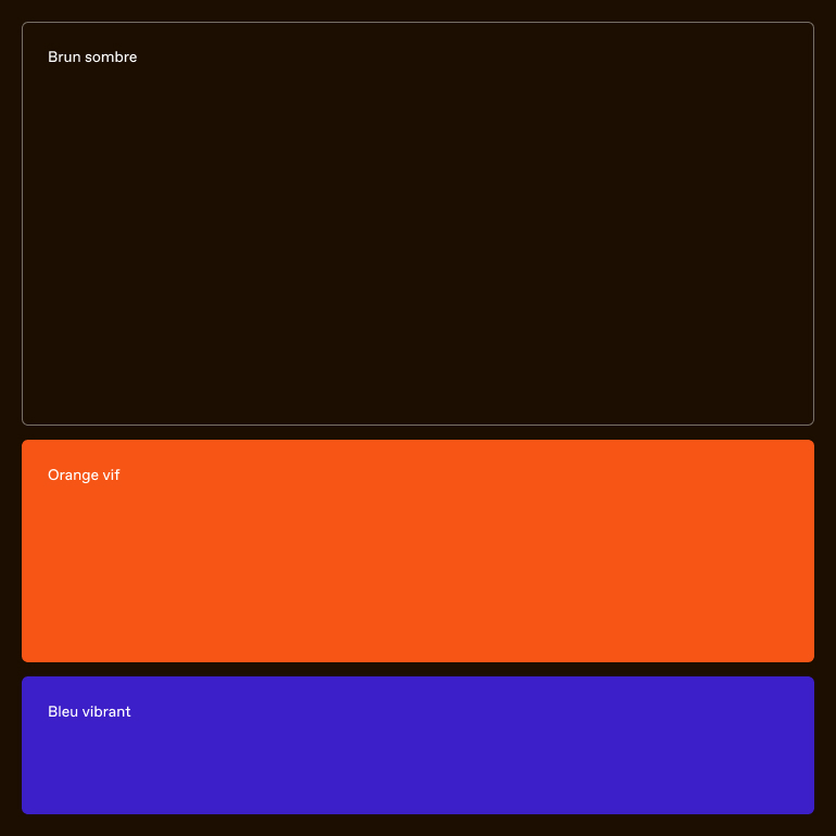
Colors
Orange and dark brown for the human side of the brand. Blue for the product and technology.
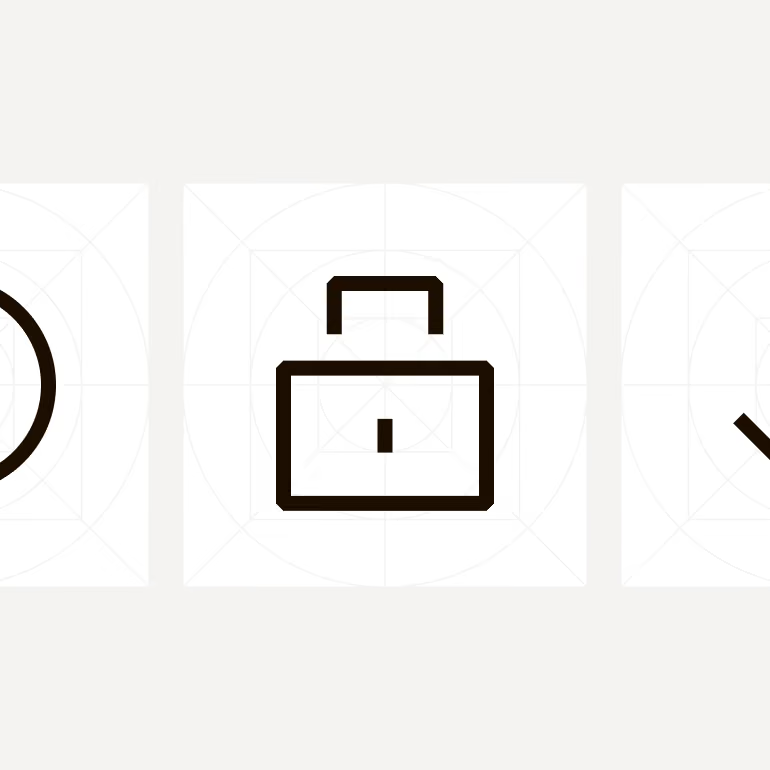
Icons
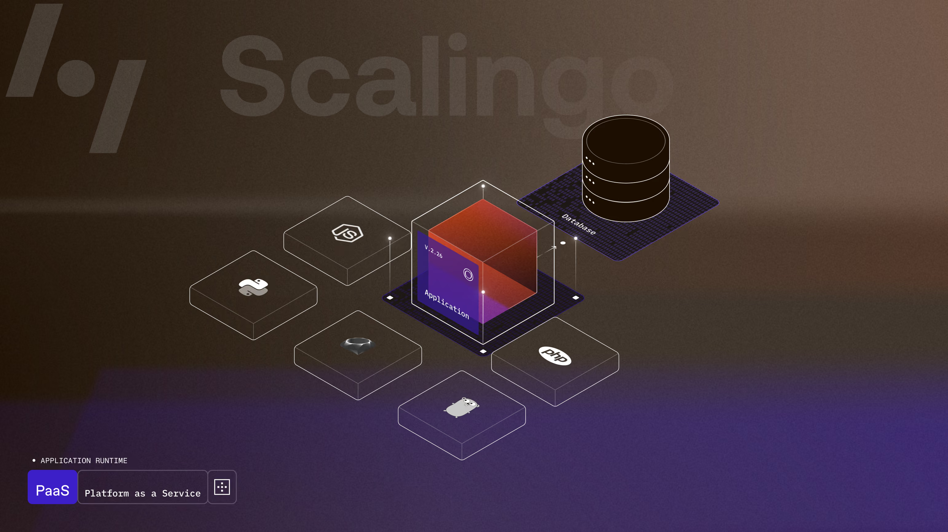
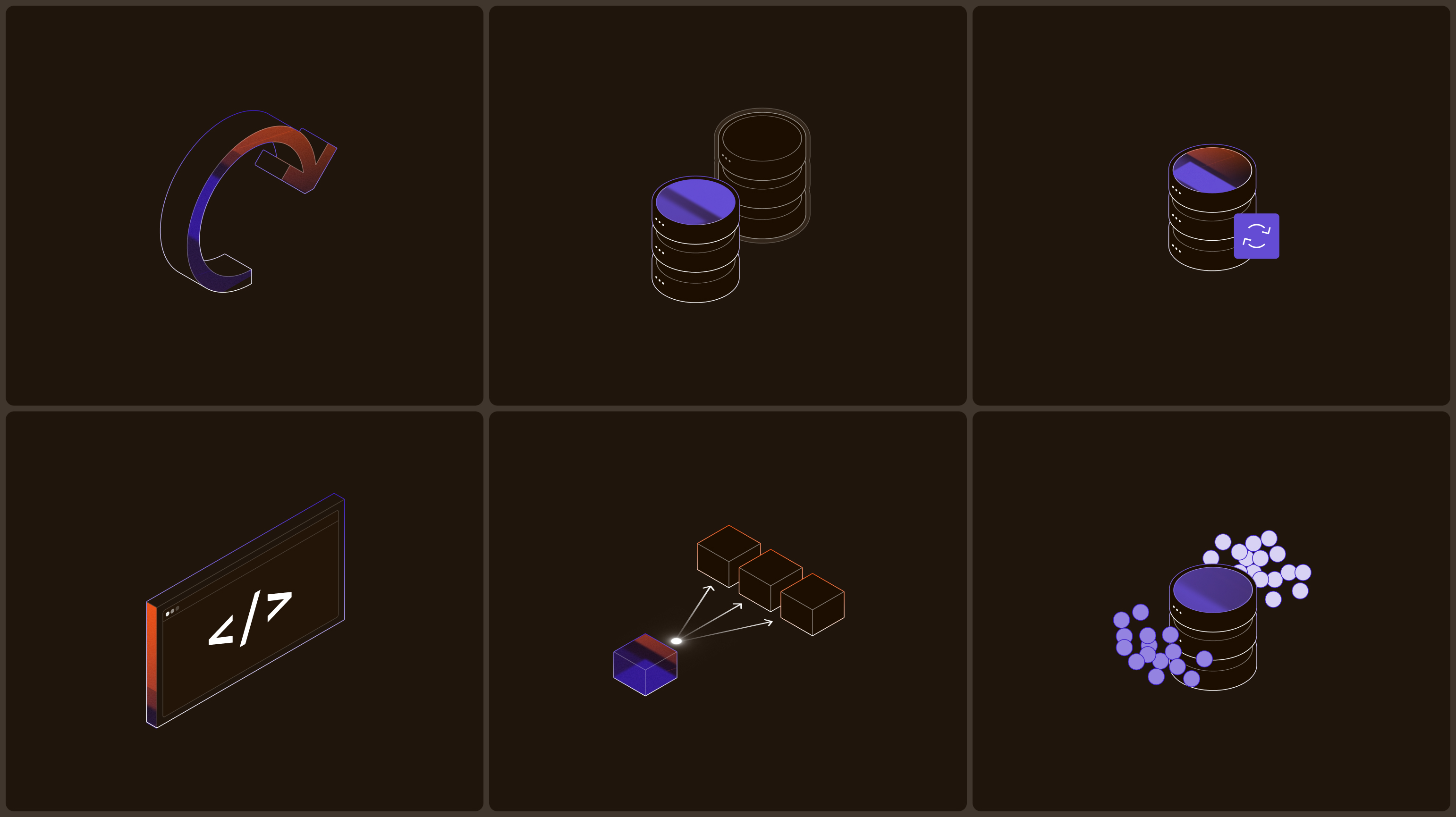
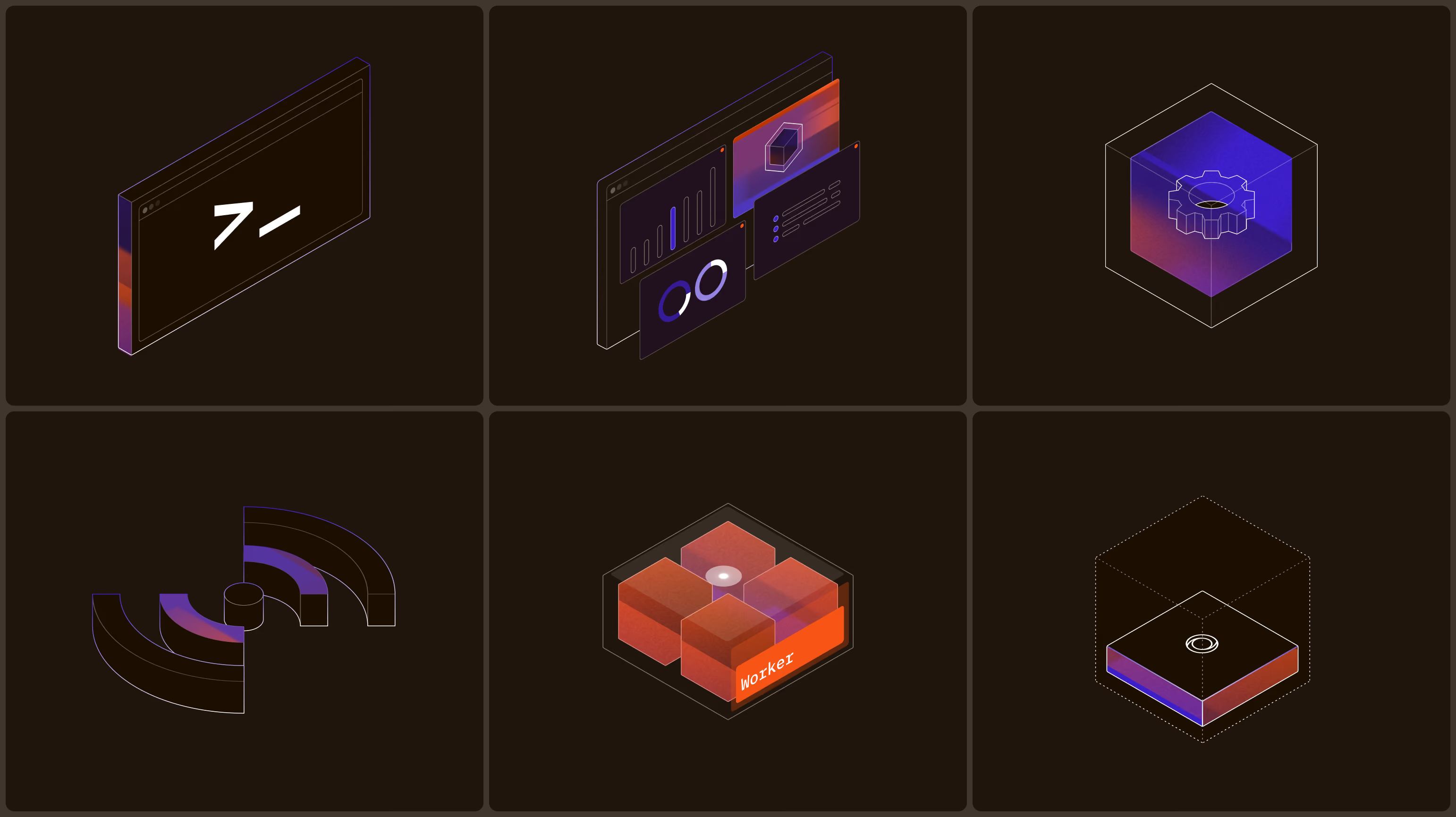
Simple isometric forms and ASCII-inspired details give the system a technical language.
In action
Built for key moments and everyday use
Scalingo’s system was built to flex across different kinds of communication: big brand moments, everyday content, hiring, editorial, and print.
Website, the brand goes to work
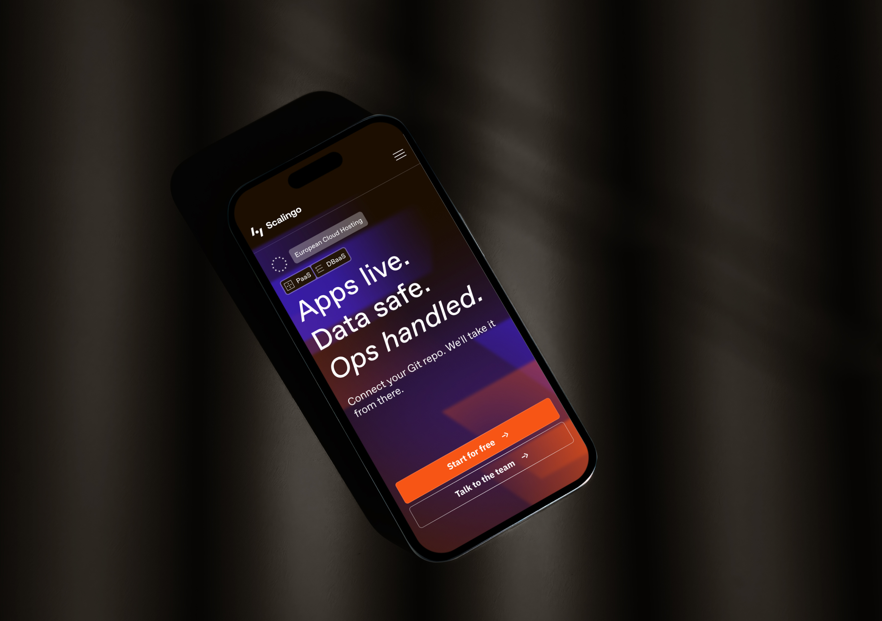
The website is where the system goes to work, with grids, buttons, links, product colours, and UI bringing it to life.
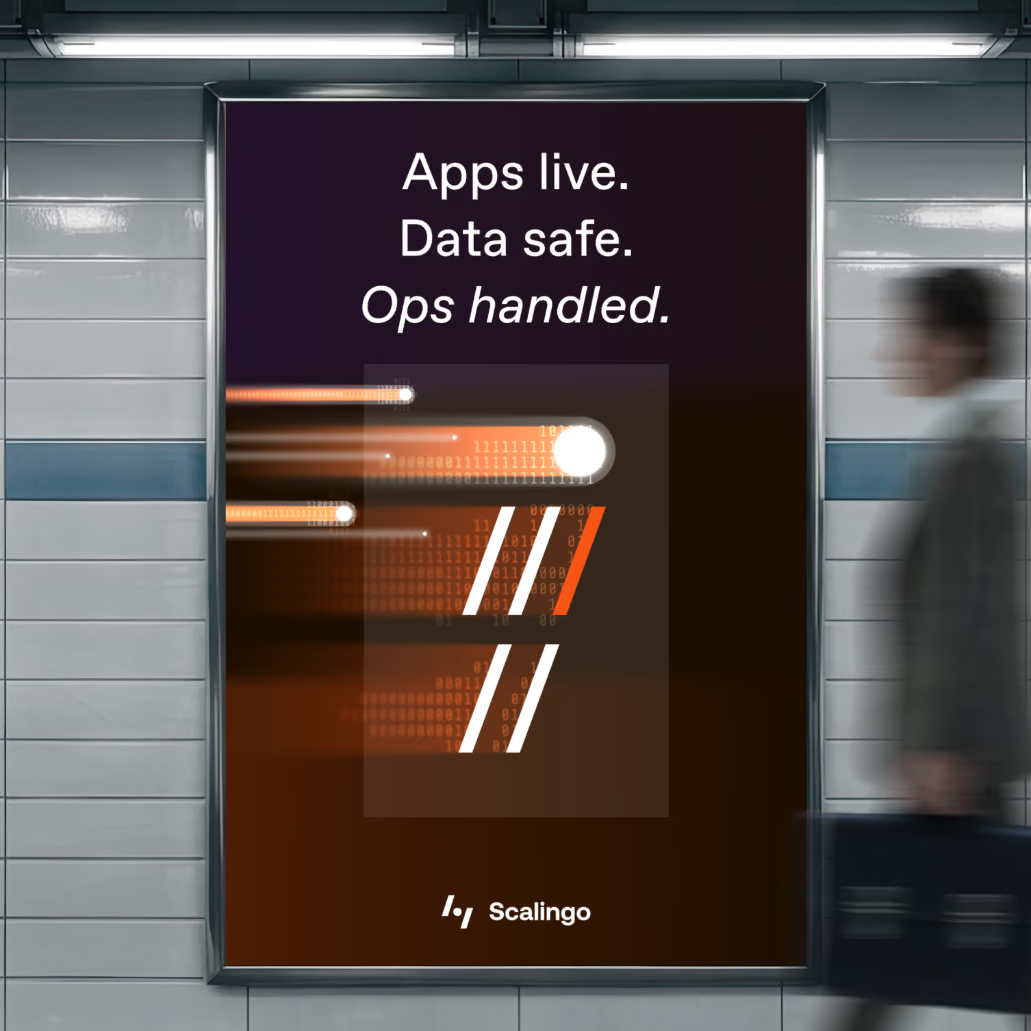

Print applications show the system outside the browser, extending the identity beyond product and website.
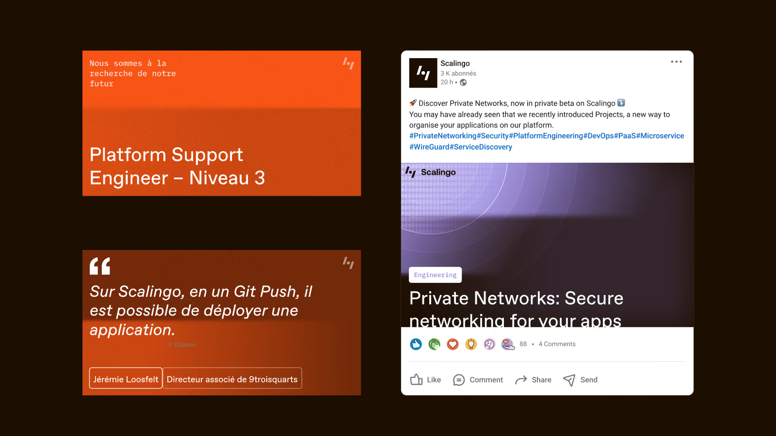
Social / editorial
The system gives everyday content a consistent structure without making every post feel the same.
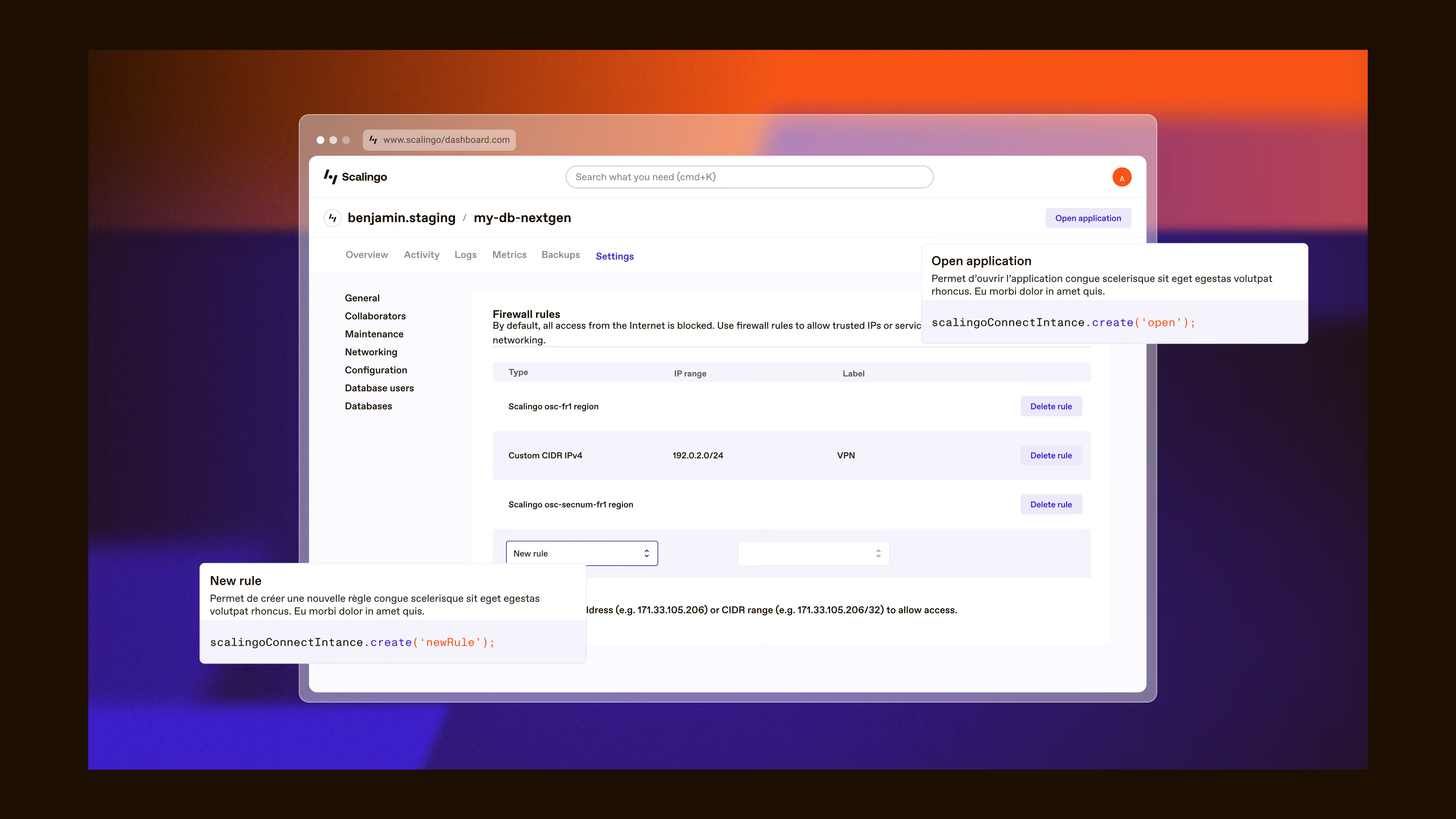
UI components
Buttons, links, states, and product colours turn the brand into a usable interface system.